In this essay I aim to closely analyse the title page (fig. 1) of William Hogarth's "Analysis Of Beauty" by using the rest of his text and then to determine whether he did, in fact, provide the basis to achieve his aim of 'fixing the fluctuating ideas of taste' in 18th Century England.
The first element of the title page that I would like to focus on is the title, which obviously has the main function of providing the reader information as to what the book is about. However I believe the typography Hogarth has chosen to use plays a very important role. The principal goal of typography is the arrangement of text (subject matter) in a manner that is both easy to read and visually engaging , Hogarth has done this by choosing an easily legible font and putting the letters in bold so they stand out, proclaiming the subject of the book.
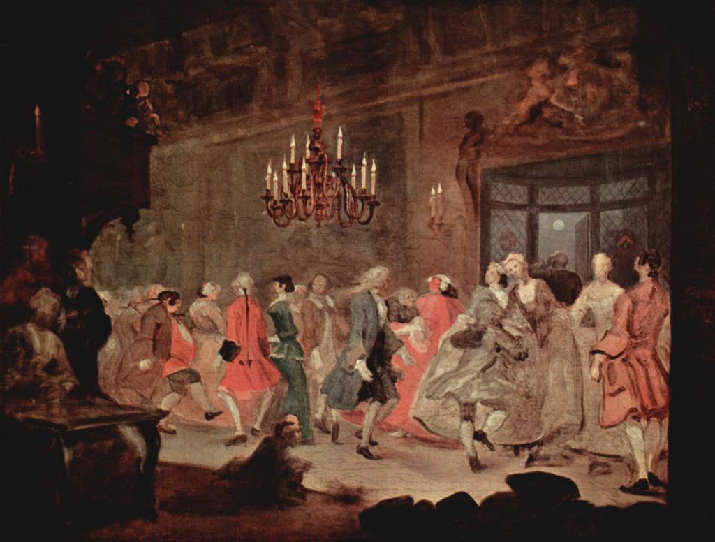 c. 1745
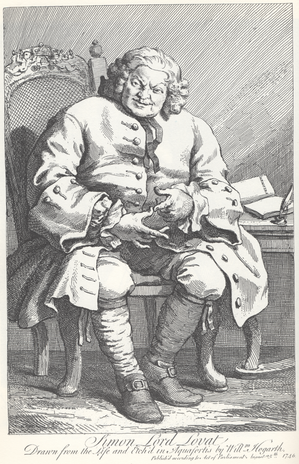 English: William Hogarth - Simon, Lord Lovat
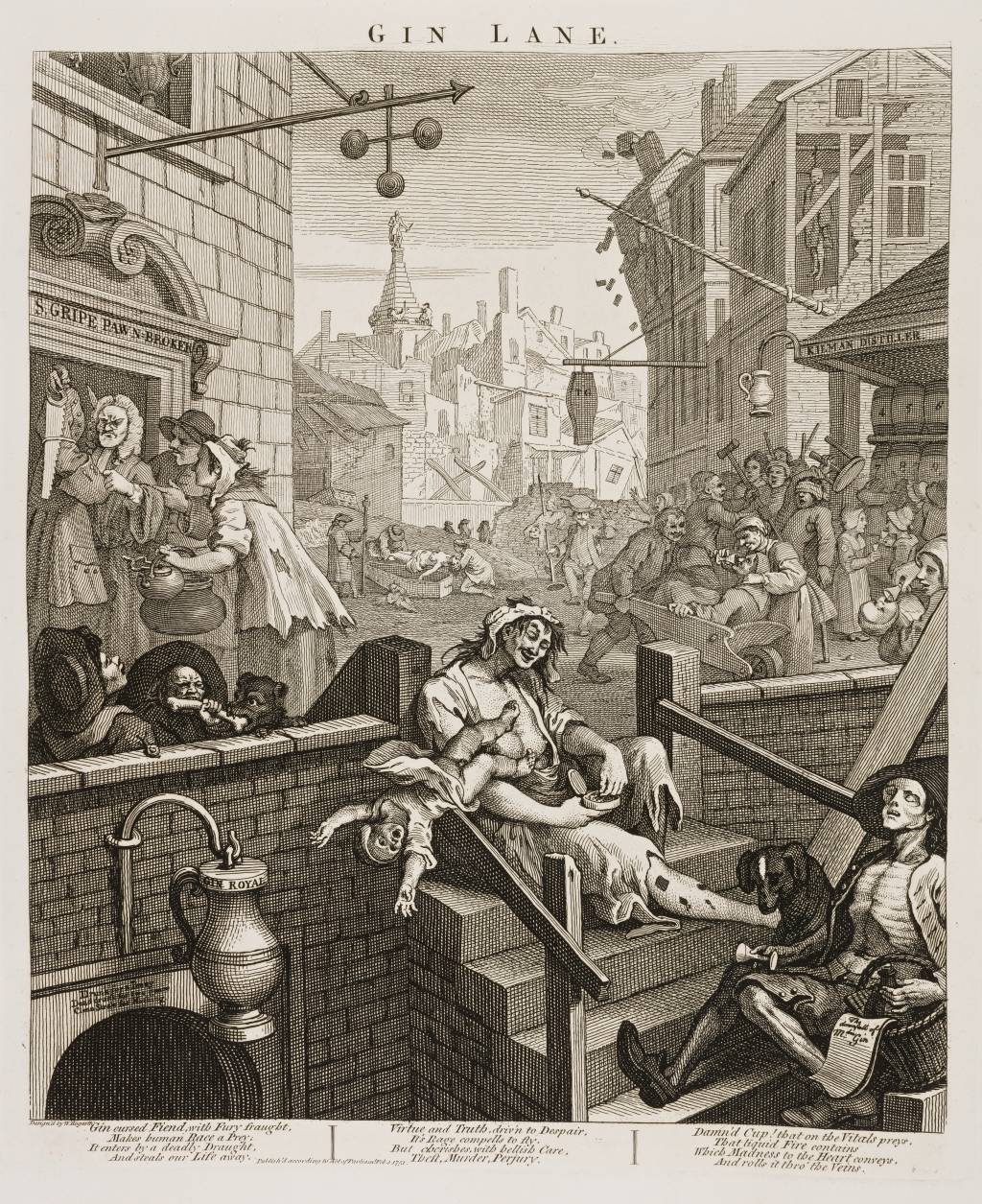 English: William Hogarth's Gin Lane (1751). Catego...
Hogarth says that the title 'The Analysis of Beauty' has 'amused' many because it was not thought that beauty could ever be satisfactorily analysed.
However Hogarth believed differently, as he states in the preface to the text. He defiantly opposes this view that beauty could never be analysed and broken down into parts (which is what he does in the text of the book) and believed that the nature of beauty couldn't be explained by 'men of mere letters'. Where previous scholars had tried to achieve this they had failed as he believed only an artist could truly describe beauty. It is this defiance that is apparent to me when I look at the title where the word 'analysis' is in much bigger font and in bolder letters than any other word on the page. Almost as a 'slap in the face' to...