Introduction.
In this paper, I shall analyse the catalogue produced by L'Occitane. I will analyse the design and layout of the catalogue. Aesthetics such as colour, typeface, alignment and balance would be critically looked at. Other aspects such as the language, the quality of the paper and the effect of the front cover would also be examined.
L'occitane.
L'Occitane is a unique brand that produces products ranging from personal care to home fragrances. The products are highly renowned for its traditional manufacturing techniques using natural ingredients, primarily from Provence. The company was founded by Oliver Baussan in the south of France in 1980. Since then, L'Occitane stores have opened in nearly 60 countries.
Front Cover.
Theme:
A theme is a message or topic that captures the essence and prevails throughout the whole catalogue. The theme of this brochure is 'natural beauty'. The theme is clearly illustrated by the front cover.
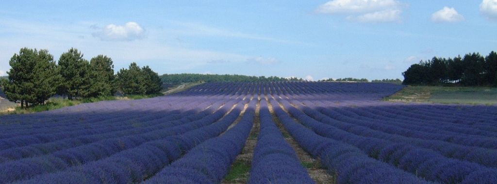 Français : Lavande en Provence
 A L'Occitane store in Shibuya, Tokyo, Japan
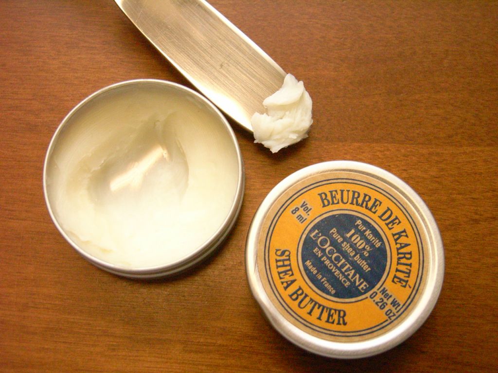 English: Shea butter of L'Occitane en Provence 日...
The background is a photo spread of a tan coloured paper with light creases and with a recycled texture. This creates an illusion that the brochure is printed on that type of paper.
The image on the front conjures an image of beauty and nature for the body. The flowers and leaves look like they have been effortlessly sprinkled on the page to resemble a human face-like feature. This image symbolizes the unity of beauty and nature.
Objective and Audience:
The objective of this catalogue is to inform consumers and potential consumers on the range of products available and to persuade the reader into buying them. Thus, it is important that the cover would attract and appeal to the reader as it would be the first thing they will see.
The target market for L'Occitane is mainly young to adult females. Although they do have products offered to men,