This website, www.chc.org is targeted to mainly Christians, City Harvest Church (CHC) goers and staff, people who are interested to know about the Christian faith and about the Church.
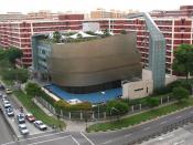
With its soft green colour theme, this website aims to inform its audience about the activities in CHC, their new building and location, the history of CHC and the people in CHC, e.g.: Staff, Pastors, members, guest speakers. It is also a place where CHC goers would be updated about the Church?s latest events and changes. The website also allows anyone who wants to donate to the CHC building fund or to just make donations, to do so through credit card transactions. This is indeed a very convenient and practical idea. The CHC website gives online sermons and hence caters to those who are not able to attend service on certain days. This thoughtful notion by CHC is further exemplified as CHC places easy accessible information on regional religion news and a search engine for one to look for anything in the bible without referring to it.
The CHC website is overflowing with plenty of information such as reviews on the latest audio products, excerpts of their bimonthly newsletter; Harvest times, and at the same time, it is easily comprehensible and user-friendly. It has a fair number of audio and video files which helps the visitor of the website to be able to explore further details on any sort of information. This allows the visitor a colourful variety and a visual outlook on the Church?s message through this website. It has a help section to notify the visitors on the requirements to view the website and the assurance of security on online transactions. This is a really good point as it serves as a guide and gives the visitors ease in...


