Visual Awareness and Design
The content is a matter of our head and our heart, but the effectiveness is a function of our visual literacy.
Graphic design deals with theme of Nonverbal Message
We become what we behold
Accomplishing the Goal
1. Identification of the problem and its contextual constraints.
2. Specification of the goals and of the criteria for acceptable solution
3. Hypothesis or invention of possible alternative solutions
4. Simulation or production of a testable representation of the proposed solution
5. Testing or the application of the acceptance criteria to the simulation of the proposed solution by the appropriate person
6. Comparison and rank-ordering of acceptable solutions
7. Implementation of the most suitable alternative solution
8. Evaluation of the implemented alternative, in use in the real-world
Phases of Design
1. Preliminary Design in which those concerned with a problem, working mostly by themselves, use chiefly schematic and abstract representations to clarify the nature of the problem and to evoke some notion of whether a solution is possible, as well some idea of the nature of the possible solutions.
 Perception
 goal
goal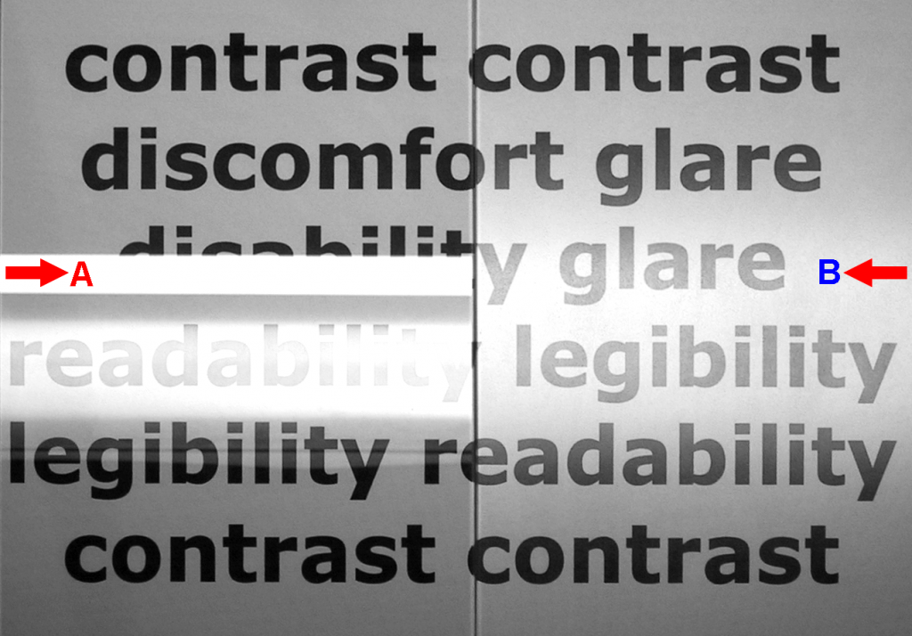 English: Reflective display with glossy surface fi...
Subsequent stages of this phase involve more specific representations in analogic and iconic form for use in testing the tentative responses of others who are, or will be, concerned with the design or the consequences of it implementation.
2. Detail Design in which, with the design constraints and criteria now more firmly established and the preliminary responses of all those concerned or affected being favorable, a more specific development of all details of the proposal is made with the aid of representations suited to the needs of those who implement them.
3. Approval in which the final reviews of all aspects by all concerned, including the public authorities, are undertaken, and, after any necessary revisions, authorization to proceed obtained.
4. Implementation wherein construction commitments are solicited and made (after possible recycling back to phase B) and the actual modification of the environment occurs. Note that the design process does not end here but continues on the next phase.
5. Evaluation and Management in which the newly modified environment takes its place as part of the world. It is at this point that the whole design process is subjected to the final and ultimate test: in the real-world manifestation of the design hypothesis, are the predetermined objectives now realized; are the acceptable criteria satisfied? Furthermore, in this phase the environmental managers must respond to changes as they occur, within the time constraints of the real-world-a process also involving new cycles of problem identification (in response to malfunctioning of an existing environment), solution hypothesis, environmental intervention, response sampling, and feedback for rehypothesis and reintervention.
Proficiency
1. Conceptual Awareness (the scientist's brain) Since the is blind to what the mind does not see, the conscious development of ability in visual design requires rational, world-mediated attention to ideas, concepts, structures, and processes.
2. Perceptual Sensitivity (the painter's eye) The perceptual readiness thus engendered is the prerequisite for your enhanced discrimination of sensory qualities, and for your effective use of these qualities in the process of communication and expression.
3. Simulation Skills (the artisan's hand) The process of design is based on the use of a variety of tools and media in the extensive simulation of design hypotheses. Your ability to use time effectively in visually manifesting your ideas to yourself and others is crucial to your professional operation.
4. Poet's Heart Willingness to share feelings about what the world could or should be. A sense of social purpose based on your empathy with the human condition is required to set the goal and establish the criteria of acceptance.
The amount you change depends on the degree of your participation, and your willingness to risk that misunderstood and undervalued experience called "Failure".
Perception can be understood to depend on
1. Empirical experience or prior knowledge serving to support your interpretive hypothesis.
2. The situational context and your perceptual "set".
3. Your personal needs or interests
4. The visual context, and the patterning of the elements in the visual field.
To Perceive: As human we attempt to make sense of, or find meaning in, this sensory raw material by creating the simplest organization of the elementary units of this pattern that is accordance with our situation set, our current needs and interests, and our past experiences.
Patterns
1. Ambiguous Figures tend to fluctuate between alternative explanations.
2. Impossible Forms information is contradictory and no reasonable interpretation is possible.
3. Camouflage occurs when the elementary units of the pattern field have such a strong visual relationship to one another that we are unable to organize them into an alternate arrangement.
a) Somatoysis- or body dissolution, where the size, shape, and color pattering of the surface of the object to be concealed are similar to that of its usual background.
b) Disruptive Coloration- when an object must appear in a variety of environments, and under different lighting conditions. Dazzle Painting in which strongly contrasting colors are applied in bold, irregular patterns across the several different parts of the object in contradiction of the actual form.
c) Counter shading- here the form revealing interaction of an object with the light source is negated by the use of a light color where a shaded surface would normally occur and a dark color where a lighter surface would usually appear.
d) Suppression of Cast Shadows- Through the crouching or flattening of an animal on the ground; by orientation to the light source such as to minimize an object's cast shadow; or by the use of flaps or screens to break up the shadow.
4. Static Visual Attributes: BPA (basic pattern areas)
a) Number
b) Position- in the field; for example, upper left, far right
c) Size- relative to the field; for example, large, small
d) Shape- as determined by the contours; for example, round, oblong, square
e) Direction- relative to the field; for example, vertical, diagonal
f) Texture- as a visual surface pattern; for example, vertical, diagonal
g) Surface Quality- for example, specular, glossy, matte, lustrous, iridescent
h) Color- as a property of the surface; for example, red, light blue, dark green
i) Surface Finish
Note that in the absence of supplementary information, or information inherent in the context, it is usually necessary to introduce some "redundancy" in the message to offset the effect of "noise".
The young designer's ego is sometimes like the baby monkey's tail- always getting in the way and interfering with operations.
Dress Rehearsals
1. Compare Adjacent Alternatives- (take inventory of BPA's)
a) How effective is your graphic layout in communicating the concepts that are at issue (i.e. demographic)?
b) Does your layout implement this order by following our culturally determined reading conventions?
c) If you use a title on your presentation, is it located in a position that is effective in terms of these criteria?
d) Have you communicated a relationship by positioning them close together, in the same orientation, and in horizontal or vertical alignment? (Does any departure from these three conditions aid communication, or does it add "noise").
e) Have you positioned elements with some regard to the "white space" as a "positive" element in itself, or have you used this white space as a sort of "packing material" in equal amounts around each of the elements so as to keep them from rattling around in the "box".
f) Have you used any graphic material (borders, margins, boxes, arrows, horizontal and vertical divisions lines, decorations) in your presentation without making visual comparison, side by side, with an alternate design without such material, to check to see if it is visual "noise", impeding communication?
g) Have you realized that in all probably the "surface quality" attributes of each BPA on your original clipping are identical, since the surface in question is only that of a piece of paper?
h) Is your "re-coding" of the several attributes of each BPA a clear and adequate graphic and/or verbal characterization? (Note that merely using a sample from a duplicate illustration only avoids the essential effort you must make to reformulate these attributes.)
i) Does your graphic craft reflect a professional level of responsibility?
Texture
Visually perceived, more-or-less regular pattering of an environmental surface, localized within the contour of a basic pattern area and helping to distinguish it as such.
Seeing texture depends on:
1. Kind
2. Amount
3. Direction of illumination
4. Condition of one's eyesight
5. Size of the basic texture elements patterning the surface
6. Contrast in the different pigmentation
7. Reflectance of the surface
8. Viewing distance- (forms, pattern, texture, tone)
Cues
Perspectives, corresponding with the gradients of adjacent stimuli on the retina.
Sensory shifts, corresponding with the abrupt changes in such stimulation.
1. Texture perspective
2. Size perspective
3. Linear perspective
4. Binocular perspective
5. Motion perspective
6. Aerial perspective
7. Blur perspective
8. Relative upward location in the visual field
9. Shift of texture-density
10. Shift amount of double imagery
11. Shift in rate of motion
12. Continuity of outline
13. Transitions between light and shade
The function of our perceptual systems is to provide us with a Probabilistic Explanation of our surroundings.
In this process our perceptual systems are sensitive to all the stimuli pattering the sensory fields, continuously monitoring these signals and interpreting their contextual significance.
A key step in this perceptual process is the division of the sensory field into a "figure" and a "ground". In the visual field, some basic pattern areas appear to belong together as parts of some "thing" (the "figure"), while the rest of the field is regulated to the ("back") "ground".
In many cases we speak of the figure-ground dichotomy in terms of "positive" or "negative" areas or spaces or forms. By paying attention to the bounding contours, which are common to both these forms, with a change in our perceptual set we can discover the "negative" spaces between objects in their own right. This fluctuation of figure and ground indicates the tentative exploratory nature of this phase of the perceptual process. When we attempt to penetrate a camouflage, we try to regroup the basic pattern areas in terms of alternate figures on new grounds.
"A vessel is useful only through its emptiness. It is the space opened in a wall that serves as a window. Thus it is the nonexistence in things which makes them serviceable"(Lao Tse)
Eastern visual culture has a deep understanding of the role of empty space in the image. Doing so the surface is divided into unequal parts intervals which, through their spacing, force the eye of the spectator to movements of varying velocity in following up relationships, and thus create the unity by the greatest possible variation of surface.
Unity of opposites
Vital elements of composition in space and time
1. The weight of empty space.
2. The sound of the silent interval.
Bipolarity of elementary cognition
1. Reference to light, strong, high, justice, far, or old necessarily implies a corresponding reference to dark, weak, low, injustice, near, or new.
2. From this we may understand that any entity, perceptual, or conceptual, achieves an independent existence only as it is differentiated from other things, and as it coexists in a dynamic unity with its opposite.
Order, not chaos, is that which can be communicated, and order is the result of constraints. (Heinz Von Foerster)
Typology
It is possible to classify typefaces under four general headings. The system is based primarily on the formal characteristics of variations in thickness, orientation of stress, and serif type. Such a classification of typefaces enables us to associate styles dating from different historical periods and provides an exercise in the discernment of form qualities (which incidentally demonstrates how categorizing and naming can facilitate perception.)
Roman- these are the classical typefaces, incorporating strokes of varying thickness and stress, and some variation in serifs. This group may be subdivided into three historical divisions, demonstrating the exploitation of gradual improvements in printing inks and papers:
1. Old style- with moderate variation in weight, oblique stress, and strongly bracketed serifs
2. Transitional- with greater variation in weight, nearly vertical stress, and moderately bracketed serifs
3. Modern- (dating back from the late 1700's), showing great variation in weight, vertical stress and "hairline" serifs.
Egyptian- or "square serif", is characterized by strokes of nearly equal weight, and heavy, sometimes square or "slab" serifs. Legend has it that these boldface types originated to meet the needs of long distance visual communication in the coarse of Napoleons campaigns in the Egyptian desert.
Gothic- faces are also called "sans-serif" and in general show an apparent uniform weight, and, most characteristically, no serifs. The name is originally one of opprobrium, for these faces were all at one time thought to be crude and grotesque.
Miscellaneous- incorporates all typefaces that do not clearly belong to any of the faces mentioned in the above categories, and includes the several script typefaces, the "Text" or "Black Letter" faces, and the thousand of "ornamentals".
A given typeface is able to evoke a period, an era, a personage, or a situation.
Form & Content
Nonverbal Communication
1. Illustrators-, which are actions that assist, explain, or amplify meanings.
2. Emblems-, which are gestures with, standardized meanings, which can stand in for speech.
3. Affect Displays- or facial patterns that express inner feelings.
4. Adaptors- which are customary gestures indicating an emotional state.
Visual Integrity- The matter of wholeness or honesty of the relationship of form and function. For the designer, ability in the visual communication of character and meaning is the most essential qualification. Your graphic should "say" it and "be" it.
Success in Design depends on your willingness to actually manifest (not just think) these simulations- to physically produce them in multiple and systematic variations and to display them side-by-side. There is no substitute for this work, and everything hinges on doing it well prolifically.
Visual Clarity of Context-In testing these designs, try thinking of them as 15X20 billboards located along a highway, and ask yourself if the message could be grasped by someone passing it by at a speed of over 55 miles per hour; in other words, in a glance. For another test, consider if the person seeing the billboard does not speak English could get the sense of your meaning by just seeing your design. Are there alternative meanings? Is your design ambiguous, because of several possible interpretations?
Death Trap- Be sure to watch out for the death trap syndrome; it is often fatal amongst novice graphic designers. This occurs when a student starts to panic over an apparent lack of ideas and persists in elaborating the first even halfway possible solution in trivial detail, to neglect further explorations.
Visual Analogue- The idea or meaning embodied in a given word, in which the graphic presentations of this word both "says" it and "is" it.
Visual Organization
Review- The preceding problems have introduced the concept of the basic pattern area as the elementary sensory unit of the optically differentiated visual field, and much of our work has been concerned with various aspects of the number, position, size, direction, shape, color, texture, and surface-quality attributes of these basic patterns areas as they are appear in the visual field. We have also considered the process of perception, which is interpretive activity of the viewer in ascribing meaning to these optical differences and present circumstances, expectations, and interest. We have noted that the process of perception involves the tentative association of some of these basic pattern areas into a "figure", in reciprocal and reversible relationship with the rest of them, which remain as a "ground".
Heterogeneous Visual Field- (consisting of dissimilar {deprived of illusion} elements or parts) the conditions that facilitate this state have been identified as:
Proximity- The law of proximity states that the relative closeness of some units to each other as compared to others at a greater distance will cause the closer elements to be seen together as a new entity. The greater the relative physical proximity, the stronger the tendency for a visual association. This is the simplest condition for relating discrete elements into larger wholes.
Similarity- The law of similarity concerns the tendency of commonalities in the attributes of a number of separate elements to relate them as a group. Similarities of form, size, direction, color, or texture will serve to associate a variety of discrete units into a new and larger whole. Note that this organizing tendency may be in competition with the law of proximity and, if so, will produce perceptual "tension" in the visual field.
Continuance- The law of continuance refers to the relating tendency of similarities in the changes in the attributes of a series adjacent basic pattern areas. These similarities may be a progression of graded changes in size, shape, direction, hue, value, chroma, or texture. Continuation also applies to consistencies in the direction and linear character (straight, curved, jagged, wavy) of the "in-lines" (lines within) or outlines (bounding contours) of the adjacent basic pattern areas.
Closure- The law of closure deals with our perceptual tendency to group certain visual elements and, by "filling in" the gaps between them, to establish one simple larger form. The completion of latent connections to produce new virtual forms takes place in two, three, or four dimensions.
Vocabulary
Art- Illustrations and artist-prepared materials used in layout.
Ascender- That part of the lowercase letters (b,d,f,h,k,l,t) which extends above the mean line.
Base Line- The Imaginary horizontal line on which all letters stand.
Bleed- Said of type or art when extends beyond the trim line.
Body Size- The vertical dimension of the typeface, measured in points, usually including the x-height, ascenders, and descanters.
Body Type- The main typeface used in a text, usually less than 14 points in size.
Bold Face- A thicker version of a typeface.
Caps- The 'uppercase', or capital letters.
Characters- The individual letters.
Comprehensive- A complete simulation of body type, display headings, and art.
Condensed- A narrow version of a given typeface.
Copy- Any matter to be sent to type.
Descended- That part of the lowercase letters (g,j,p,q,y) which extends below the baseline.
Display Type- Typeface usually 14 points or larger, commonly employed for headings, titles. Etc.
Extended- A wider version of a given typeface
Face- The style or design of a given alphabet..
Flush- Body type set without indentations
Gutter- The center of an open book or magazine where the two facing pages adjoin at the binding.
Heading- Bold face or display type, as used for titles.
Italic- The version of a typeface in which the characters slant to the right. Sometimes called cursive, or oblique.
Justified- A line of type word-spaced to a given measure.
L.C.- The "lowercase" or small letters
Leading- Line spacing between lines of type. In general, to ensure good readability, for a given x-height the leading should increase as the measure increases.
Letterspacing- Adjustment of horizontal distances between individual letters so as to achieve a uniform appearance within a word.
Light Face- A thinner version of a typeface.
Line Spacing- See Leading
Mean Line- The imaginary horizontal line along the top of the lowercase letters without ascenders. (See base line)
Measure- The length of a line of type, usually expressed in picas.
Pica- A unit of measurement equivalent to 1/6 of an inch.
Point- A unit of typographic equivalent to 1/72 of an inch.
Roman- The version of a typeface in which the characters are vertical. Also a category of typefaces.
Serif- Finishing strokes crossing or projecting from the ends of the main elements of a letter.
Solid- Said of the lines of type set with no leading.
Text Type- Body Type
Trim Line- The line along which pages will be cut to their final dimension.
Wordspacing- Adjustment of horizontal distance between words so as to justify a line of type.
X-Height- The vertical distance between the base line and the mean line; or height of lowercase letters not including ascenders and descanters.
Shifting Elements On Layout
RelateSubtract
AddInterchange
OmitLower
Exaggerate Wider
UnderstateLonger
InvertShorter
ReverseNarrower
TransposeSelect
SubstituteEnlarge
CycleReduce
RepeatIncrease
DivideExchange
RhythmRelocate
VeryCombine
RotateAssociate
InclineMerge
JuxtaposeCompare
ContrastSeparate
Break UpOppose
TransformUpend
TranslateHorizontal
CondenseVertical
ExpandCurve
FreeHigher
A random or accidental patterning of visual elements can only give evidence of the process that produces it. As visual designers interested in conveying ideas or information, expressing feelings or moods, and communicating intentions and attitudes, we need to be aware of the principles of perceptual organization, and skilled in the art of applying them.
Color Attributes
Thus any color perception has three characteristics, any one of which can be varied independently of the other two. In psychological usage, the correct term is attributes, because we are really describing sensations, not the object or the physical stimuli reaching the eye.
Hue- we identify as the basic color of the object.
Brightness- basic color of the object with adjectives of light or dark attached.
Saturation- basic color with adjectives like vivid red, or dull red.
Tints- are the result of the subtractive mixing of hue with white.
Shades- are the result of the subtractive mixing of a hue with black.
Tones- are the result of a subtractive mixing of a hue with black and white.
Value- indicates the degree of lightness or darkness of a color in relation to a neutral gray scale.
Chroma- indicates the degree of departure of a given hue form a neutral gray of the same value.
Develop an almost instinctive ability to discriminate and generate nuance (a subtle or slight degree of difference, as in color or tone) of response.
Achromatic- colors are those without the attributes of hue and chroma; in other words, the blacks, grays, and whites of the vertical scale at the center of the Munsell color solid.
Monochromatic- colors are those of the same hue but of differing value and saturation; in other words, colors on any single vertical hue plane of Munsell color solid.
Analogous- colors are those whose hues are closely related, such as blue/green, or red/orange; in other words, those colors on adjacent vertical hue plans of the Munsell color solid.
Complimentary- colors are those on diametrically opposite vertical hue planes of the Munsell color solid. When mixed subtractive complimentary colors will tend to produce an achromatic color of lower hue.
High Key- refers to a color composition in which all colors are a high value; in other words, those are the upper third of the Munsell color solid.
Low Key- refers to a color composition in which all colors are of a low value: in other words, those colors at the lower third of the color solid.
Color Analysis of Scene
Characterize the color effect of the whole, as visual designers we are concerned with the overall color impression of both existing and proposed environments.
Temperature Feeling- central tendencies in hue histogram we can then characterize the type of color combination, and also hypothesis the psychological result.
Mood Feeling- from the inspection of the central tendencies of the value and the chroma histograms can we then hypothesis the psychological results.
Problem Solving
Perception- How will it look to them?
Professionalism- Create a memorandum breaking down stages of problems to solve, then give an approximate time estimate.
Characteristics of creative people.
1. That they keep all of the experience accessible for use.
2. That they develop a facility in applying that experience.
3. Creativity exists only in the degree that it is communicated to others.
4. Your intentions may be very clear to yourself, but unless the users are equally well informed, your efforts come to nothing.
5. Did you clearly identify each with its indented use (applying to previous discussed criteria for good lettering)?
6. Did you get it with one or more paint manufactures' identification codes?
7. Or with Munsell's identification (applying your previous color classification)?
8. Is your over all arrangement simple, logical, and understandable, and will also be durable in use?
Comprehending a problem demands the ability to simulate actual operating conditions. Two color swatches side by side may be easily seen to be somewhat different. But how easily will they be discriminated as different when separated in time and distance?
Did your design assume that all the users would be extraordinary gifted in color sensitivity and color memory?
There is a systematic hierarchy implicit in the relationships of divisions, sections, and departments of the given institution. Have you expressed these rational similarities and differences with your colors?
Is your design systematic or is it arbitrary decorative?
Culturally determined color associations and Institutionally standardized color codings exist as potential advantages and resources for this problem.
Have you availed yourself of them by reference to your library catalogue and conference with librarian?
What about that minority of the general population that are color blind?
What might be done to serve their interests in this area (beyond the arbitrary limitations imposed in this problem)?
Can you think of any precedents?