Compare and Contrast Essay
For my compare and contrast essay I have chosen the painting "Sunrise" by Claude Monet. Claude Monet is an impressionist who painted with stress on color and light. Monet painted the "Sunrise" in 1872. This is during the time where impressionism was at its most potent.
The scene is of a body of water possibly a river, with row boats on it. The time of day seems to be dawn when the sun is just rising over the horizon. Monet uses brush strokes to make shapes but in contrast there are no real definite shapes. He uses shades of blue to capture the light on the earth as the sun rises. Orange is used above the sun to show the sun rays beaming through the darkness.
The texture of the painting seems to be rough because of the paint strokes and you can see the difference between the depths of each stroke.
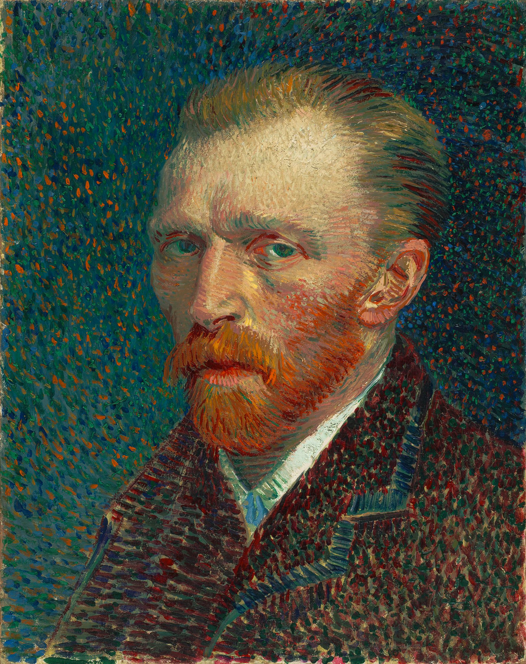 Self-Portrait, Spring 1887, Oil on pasteboard, 42 ...
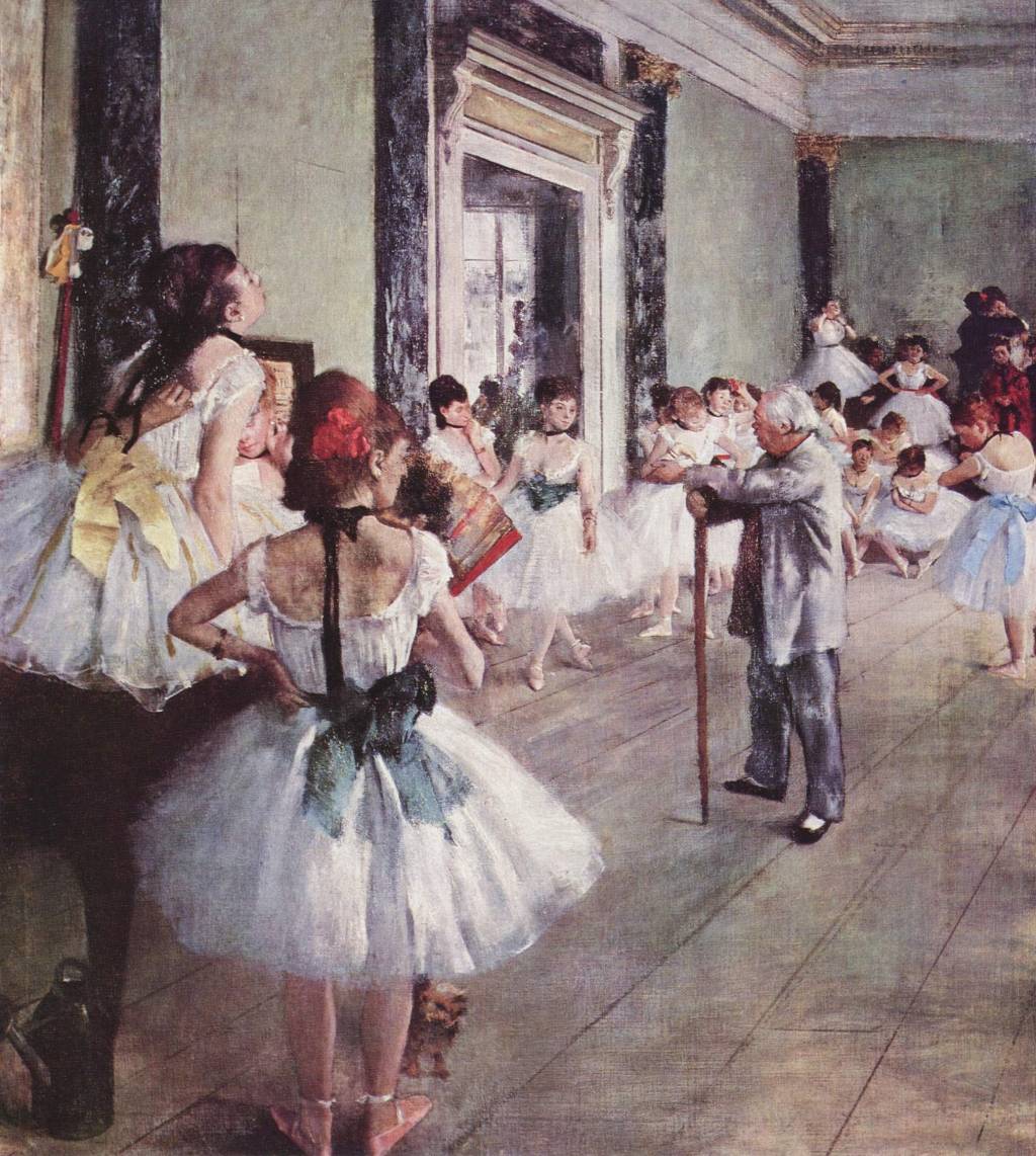 The Class of Dance by Edgar Degas (1874)
 Français : Edgar Degas
His stroke use in this work reminds me of the stroke work in Vincent Van Gogh's, "Self Portrait with Gray Hat". Van Gogh's stroke work is very visible and seems to be of a rough texture.
There is a rhythm to the waves in the water apparently being produced by the boats. The painting is asymmetric in balance. Both sides of the scene are not exactly alike so the work is not symmetric. On the other hand, the colors used to depict the land, sky and water are balanced in a way that nothing looks out of place. If Monet were to put a green tree in the middle of all the bluish-purple trees then the painting would not be balanced and the tree would be out of place. However, all the colors used are uniformed and blend into each other. I...