This is a summarized report on a table that I have made on document comparisons. I have compared different documents to try and analyze them and see if they have any common characteristics such as: font size; layout; colour; position; orientation and corporation. The documents that I have used are different. I have one document which is a junk mail letter from tops pizza, I have another which is an informal letter from JD Sports and I have a business letter from British gas. My findings are put down below.
I will first start with the promotional leaflet/junk mail letter from Tops Pizza. This well known company for selling pizza and giving the buyer free delivery is advertising their menu and in order to do this they are using several techniques. The company is also advertising their great specials and offers that they have at the moment. Their target audience is mostly young people (teenagers, people studying, bachelors and young couples) aged from about 15 to 30 years of age and have money to spend.
 Typical advertising mail
 Victoria Buildings - 1 - 7 Corporation Street, Bir...
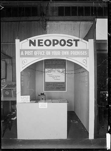 Stall at a trade fair advertising and displaying N...
Also the logo of this company is easy to remember as it is jus a black top hat and the name of the company below. The orientation of this document is landscape and looks like most leaflets nowadays- folded and opens up as a menu would. It is printed on A4 paper and I would say that the font size is about 14-16. Colour on this junk mail is evident and it has bright colours and a lot of pictures. On the cover it has a big picture of slice of pizza which immediately tells you that they sell pizza. All this colours and pictures appeal to young people. About 90% of the space on the page is used up and this is good because...
Document comparisons
You've submitted an interesting essay on comparing different documents in order to see if they have any common characteristics. Since the documents you chose were dissimilar, it is not surprising that you concluded that they generally differed in such attributes as font size, layout, color, position and orientation of the page. It also seems intuitive that the target audience of the document has a great deal to do with its characteristics. Nonetheless, your report was well expressed and presented. Fine effort!
4 out of 4 people found this comment useful.