We all undoubtedly have experienced a part of ESPN at one point and time, and those of us who have sports nuts for boyfriends (like me) are forced to do so rather often, whether we want to or not. We groan as they put it on the television (especially when Friends is on). It was because of these incidents that I have chosen to critique ESPN's web page, www.espn.com. This site has too much information to talk about in a short essay so I will simply discuss the overall layout and design. I would like to point out my conclusions about specific aspects of ESPN's page, highlighting a few specific areas.
My first reaction to ESPN's page design was positive. They have chosen text and graphic placement to provide the maximum amount of information the space will allow. The links to various sections and articles are clearly indicated and easy to locate.
 'Ba'lbek, Collones du Grande Temple, vue du sud', ...
 ESPN.com Video Beta Screenshot Detail - 09/07/07
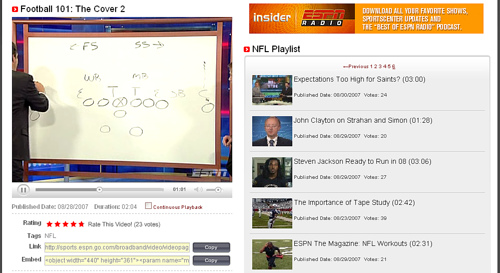 ESPN.com Video Beta Screenshot - 09/07/07
The overall design of this page is good. However I noticed that there was an excess amount of things going on. When you first open the page, two pop ups appear, one for miller light and the other for orbitz gum. I thought there were way too many links on the first page. This site is, overall, user-friendly. Almost any viewer old or young could easily navigate. Also, it changes daily, to keep the viewer interested, and to keep from being too repetitive.
The page's overall design is good. The use of columns to indicate links to pages provides the viewer with easy access to the information. For instance, if a viewer wanted to read about the NBA playoffs the information is easy to locate in the column to the left. First time viewers should have no trouble recognizing these as areas they must...