Monet's use of color along with use of intricate brush strokes and composition is outstanding. The vast variations of brush strokes and color placement techniques are what make his work so unique and individual. Grand Canal, Venice, 1908 is a prime example of Monet's talents in these areas. The structure of the painting is very loose. There are few hard lines in the composition that represents solid structure. The curves in conjunction with the shades of color as well as light usage give the piece a mirage-like effect. It is easy to imagine Monet's vantage point while he was painting the picture by the way the composition is set up. One can tell he was looking towards the buildings on the other side of water because it's obvious that the building are being reflected as well as the wooden poles sticking out of the water. It is quite evident that Monet is observing a sunset and that he is painting quickly to capture the full effect of light during this short period of the day with the study of light being the main focus in this work.
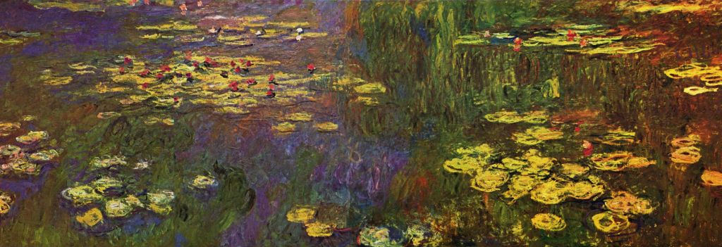 Water Lilies
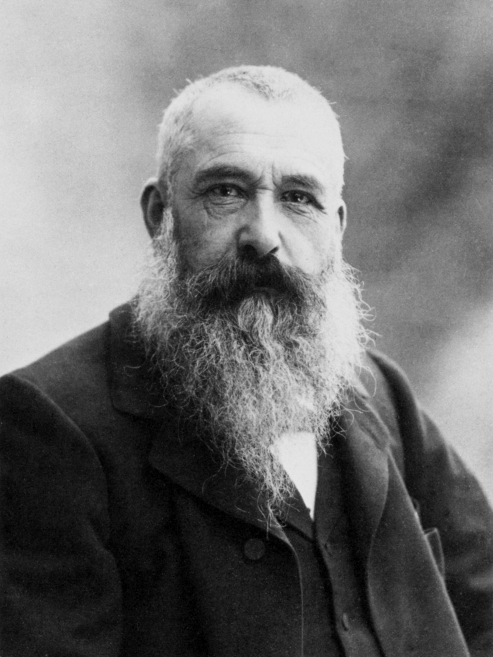 Claude Monet, photo by Nadar, 1899. Français : Cl...
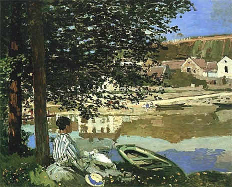 On the Bank of the Seine, Bennecourt (1868), an ea...
Shadow also plays a large part in the make up the painting. Monet uses an even tonality of blues, lavenders, oranges and pinks to create the buildings across the water, thus showing the sunlight reflecting off the sides of them. It's quite amazing how he uses many different colors to create one large color. For instance, in the sky he uses a mixture of greens, pinks, oranges and blues to create the feeling of dusk as the sun slowly sets to the right of the picture. In the far edge of the water he uses greens and blues with a hint of lavender here and there to show the darkness of the...
Monet
Yours is a well written essay. I would only point out that an essay of over 1400 words should be broken up into paragraphs so that it will be more appealing to readers. It would be unfortunate if such a good essay as yours weren't read by those who might find one long paragraph somewhat uninviting.
5 out of 5 people found this comment useful.