The chart represented is called a pie chart; a pie chart is a circular chart cut into segments demonstrating relative magnitudes or frequencies, also known as a circle graph (Merriam-Webster Dictionary, 2008). "Pie charts are usually used to show relative frequency distributions" (Bennet, Briggs, & Triola, 2009 p. 103); this type of chart is used to give a quick visual representation of the subject as a whole breaking it down into more defined sections. Pie charts are usually used to present qualitative data (Bennet, Briggs, & Triola, 2009 p. 103). Qualitative data is information consisting of values that explain qualities or non-numerical categories (Bennet, Briggs, & Triola, 2009 p. 457). Given the target audience of the chart, this was an effective way to represent the data it provided, so it could reach and be easily understood by a broad audience with multiple levels of education and cultural backgrounds.
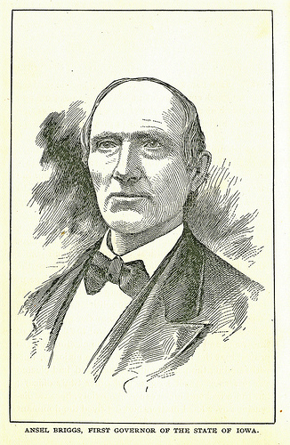 Ansel Briggs
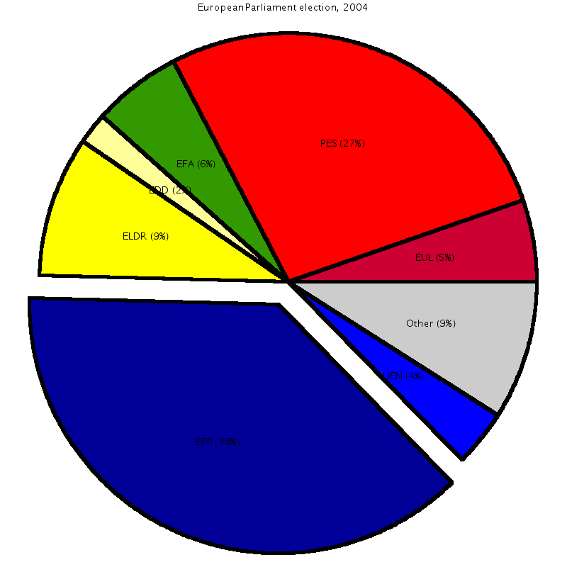 An exploded pie chart for the example data, with t...
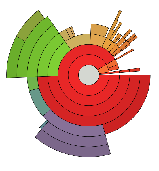 Screenshot of for illustration of Multi-level Pie ...
The format of the website has made effective use of the data being displayed. The pie chart was the proper chart to represent this data given the target audience. It is easy for the general public to look at pie chart and understand the information presented. The U.S. Department of Health and Human Services web site, gives a quick image of insurance coverage of the patient population serviced by health centers across the United States. This pie chart is the best way to educate such a broad audience. It is easy to look at the pie chart and see the majority of people in the United States who go to health centers are people without insurance and those with Medicaid. If presented with the same data, I would also present my information using a pie chart, so the audience would be able to better understand the information...
Pie Chat
I thought that the title might be some sort of a pun on the term "pie chart." Having read the essay, I think it is more a case of sloppiness on the part of the writer. Oh, well.
0 out of 0 people found this comment useful.