In comparing and contrasting the etchings of Anna Clement's Rialto at Venice and Frank Brangwyn's Venetian Scene, we have to look at the different ways the artists portray their subject matter. Despite their common theme we can see from the outset that they are treated differently by each artist. There are similarities in the illusion of space, volume and shading between the two but lighting, use of line, composition and framing are very different from each other. The Clement piece gives us the impression of the bridge as a fine architectural monument with intricate and elaborate designs. While Brangwyn is more interested in portraying a daily Venetian scene rather than concentrate on the bridge, he does show that the bridge plays an important part for the people in Venice.
The title of Clement's print helps us in identifying the subject matter of the etching. It gives us a specific place and knowledge of the etching and this assists us in identifying with the artwork.
 Benj0s, Me... and Alan Clements!
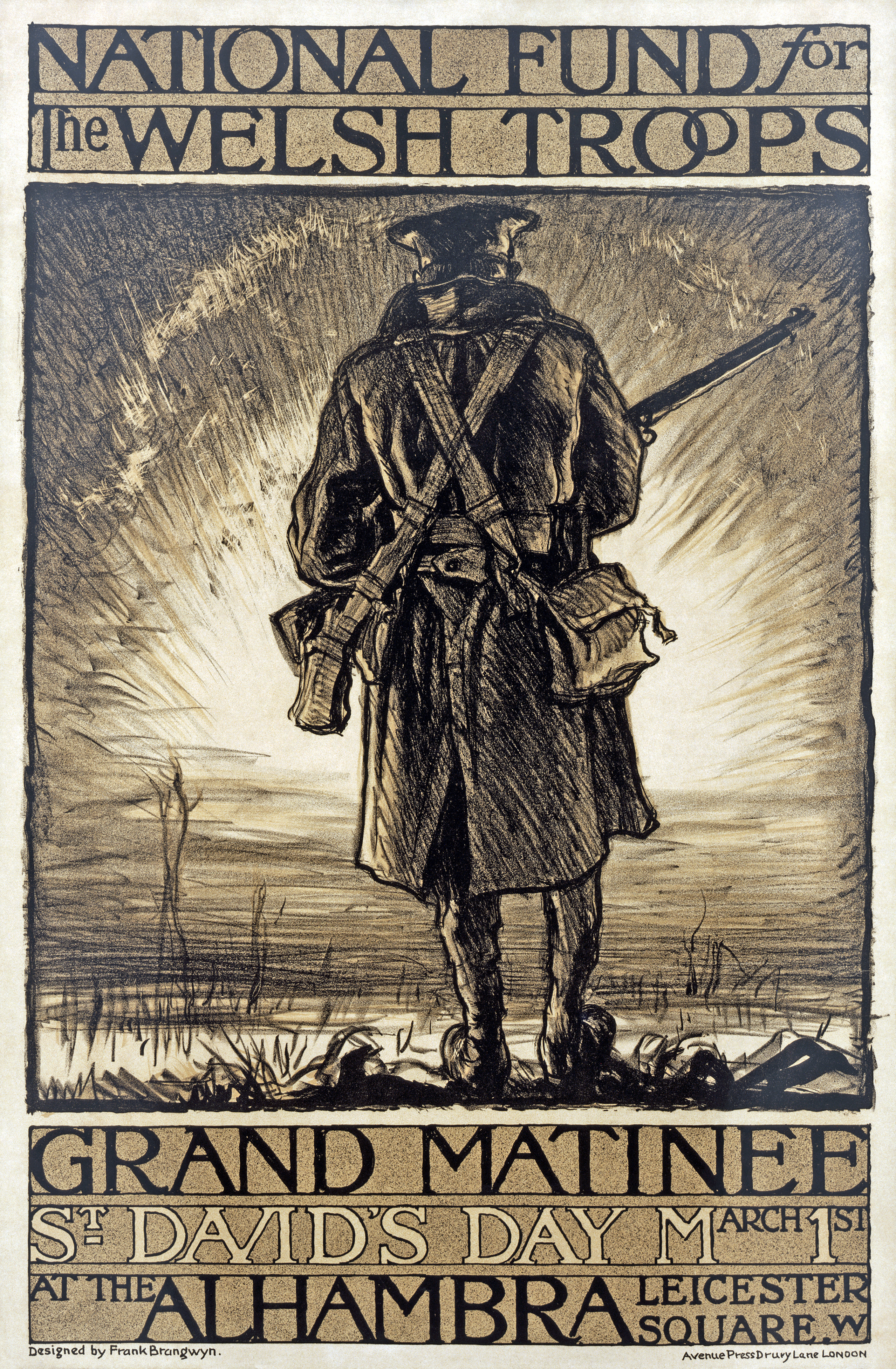 "National fund for the Welsh troops. Grand Matinee...
 Clements Mountain
The subject matter is clearly defined as the bridge. In the case of Brangwyn, the title gives us an obscure meaning of the subject matter. There is no specificity as to which scene in Venice is depicted. It is not a freeze-frame, instantaneous moment like the Clement- this composition is a reduction of an event to its essence.
The framing in the Clement immediately establishes the bridge as the main theme of the etching. The framing puts the bridge at the very center and the eye is at once drawn towards it. All the other objects recede geometrically from it from that point. On the other hand, Brangwyn's framing of the bridge also does not help us in identifying with the subject matter. We cannot even make out the subject at first sight of the print. The framing also doesn't seem to contain the entire picture within the boundaries of the etching. It spills out over the frame. It is as if the mass of the whole bridge cannot be contained within the boundaries.
Both works use shading to give a sense of mass and volume to objects. However, the volumetric sense is much greater in the Clement. The bridge is an imposing structure and towers over the rest of the picture. Clement renders visible highlights in the undersides of the bridges which gives us a sense of three-dimensionality. We can see the illusion of mass and space in the buildings and also by the underside of the bridge- they all give a sense of delicacy to the structure. In the Brangwyn print, the figures and gondolas are flat, and the figures in particular are, barely etched on. Maybe he wishes to show the viewer how oblivious Venetians are to the significance of the bridges. The only sense of three-dimensionality is given by the different shading of the bridges in the foreground and the houses in the background. Brangwyn's etching shows little in either the solid tangibility of things or in the human or social significance of work.
There is an illusion of space in both of the etchings with objects in the print being located at different depths in the pictorial space. The Clement has a distinct foreground, middle ground and background. There is a geometric distribution of the objects in the pictorial space by the use of linear perspective: the eye is drawn to the top of the bridge and everything recedes uniformly from that point. There is an even segmentation of the objects. In the middle section there is the bridge and the houses on the banks. In the foreground there is the water and the gondola, and in the background, the sky. In this respect the Clement can be compared to some French Baroque painters of the French Academy, such as Nicholas Poussin. Poussin, in his painting Landscape with St. John on Patmos, created a "consistent perspective progression from the picture plane back into the distance through a clearly defined foreground, middle ground and background. The zones are marked by alternating sunlight and shade"æ"à(Stokstad, 775). Like Poussin, the objects in this etching are very solid and crisp, arranged within the framework of the work. This adds to the geometry and precision of the work.
The Brangwyn, on the other hand, has no such mathematical or geometric precision. The objects are more clustered and closely compacted than the Clement. The viewer's eye first focuses on the bridge in the foreground and the scenes occurring below and above it. There are no blocks or segments that the eye can discern. There is no linear perspective or vanishing point from which the other objects in the etching recede. His work is more in the style of another French Baroque painter Claude Lorrain (Landscape with Merchants). The objects are not very crisp but seem more loosely drawn out. Their arrangement within the framework is not strictly adhered to. Like Lorrain, there is an element of deep space and the use of atmospheric nuances within the artwork. For example, a state of void is created by the sky in the Brangwyn because of the shading and gradation.
The lighting in the paintings are very different from each other. In the Clement there is a direct light source from the sun. It is partly clouded and thus the lighting is rather soft giving us the impression of approaching dusk. The lighting is spread out evenly and casts shadows of the objects in the painting. There is no direct light source in the Brangwyn. The light seems to come from a mysterious source from outside the painting. It is also not evenly spread out. It seems to light up some parts of the painting and leaves other parts in the dark. The almost harsh lighting adds to the severe contrast between the shadows under the bridge and the pillar. While the light in Clement is crisply delineated brings out the radiance of the bridge, the lighting in Brangwyn is dramatic and picturesque highlighting the importance of the bridge for the Venetians using it.
Although both artists use various lines, their character and uses are very different. There are a greater variety of lines in the Clement as compared to the Brangwyn. She uses a complex grouping of the lines that seem to weave together intricately. At places like the bridge they criss-cross together and form a sort of mesh like design. In the sky, the lines are lighter giving a softer and more understated impression. The lines that make up the shadows in the water are very closely grouped together, almost as if they are solid blocks of ink rather than individual lines. Brangwyn, in contrast, opts for a looser variety in the type of lines he uses. For example, to highlight the dark areas in the etching he uses very solid lines while Clement uses relatively precise and complex lines.
There are also several independent lines in the Brangwyn. For example, the second and third bridges have several lines that stand out in the sense that they almost seem to have been scribbled on. Some of the figures also have these lines. There are no such independent lines in the Clement, even though she too uses a great variety of lines. Each of the sequences has different lines. The lines used for etching the sky are softer and lighter than the dark and harsh ones used to represent the shadows and buildings. In both the prints there is not much in the lines to suggest movement. Rather, the lines in the Clement portray the bridge as a work of art- delicate and elegant with great aesthetic beauty. However, the lines in the Brangwyn add to the central presence of the bridge and give it a slight touch of monumentality.
Both the etchings portray a wide selection of shades. This shading provides a sharp contrast between the black and white in the Brangwyn. The underside of the bridge is sharply contrasted with the whiteness of the pillar. Similarly, the houses are also contrasted. The ones in the middle are very dark, almost black while the ones towards the side have a harsh light falling on them. There is not so much of a contrast of shades in the Clement. The light falls uniformly over the work giving it a muted shade. This sort of shading combined with the wide variety of shades gives us a detailed and analytical depiction of the rialto and immediate surroundings. In contrast, the shading in the Brangwyn is quite expressive. It does not always conform to the conventional methods of art in the way subtle gradations of light and shade are portrayed. The shading of the sky, for example, is deep towards the edges but recedes towards the center. The people in the etching, too, are shaded over giving them the impression of being overshadowed by the bridge.
The textures of the two works differ as well. In the Clement the texture is very smooth giving the viewer the impression of a serene and composed landscape. There does not seem to be any sort of vibrancy or sense of movement in the etching. It is as if the artist strives for a sort of perfect harmony by negating any type of animated strokes. Brangwyn's work, on the other hand, gives a rather weather-beaten appearance to the bridges. The strokes are much more frenzied when compared to a Clement piece.
There is a distinct pattern to the shading, lining and lighting of the object in the Clement work. For example, the sky is shown by a pattern of very delicate lines while the water is shown by a pattern of darker lines. In the Brangwyn there is a slight differentiation in pattern but it is not as noticeable as the Clement. The undersides of the bridges are all shaded the same color as are the houses in the background. But this pattern does not carry across the etching. In the Clement the three segments have more or less the same pattern throughout in terms of lighting. This is not so in the Brangwyn. The dark pillars have the same pattern but they are separated by the lighted pillar. The distortion in pattern in the Brangwyn highlights the severe gradation shades and produces a striking effect on the eyes. The eye follows the lighted pillar along the etching. The cohesive pattern in the Clement adds to the aesthetic quality of the etching. It is much easier on the eye, and not as harsh to look at as the Brangwyn. Despite their similarities in the subject matter, the two artists seem to have different approaches to their etchings. Clement seems to want to treat the etching as a picture perfect representation of the actual. She stresses on analytical and detailed aspects and takes great pains to highlight the aesthetic quality of the bridge. Brangwyn, on the other hand, wants to stress the social importance and significance of the bridge. Unlike, Clement he is not very rational or systematic in his portrayal but rather more expressive. Because of the absence of a strong focal point, the viewer's eye scans the etching, making a quick survey of the picture before passing on and out of the frame.
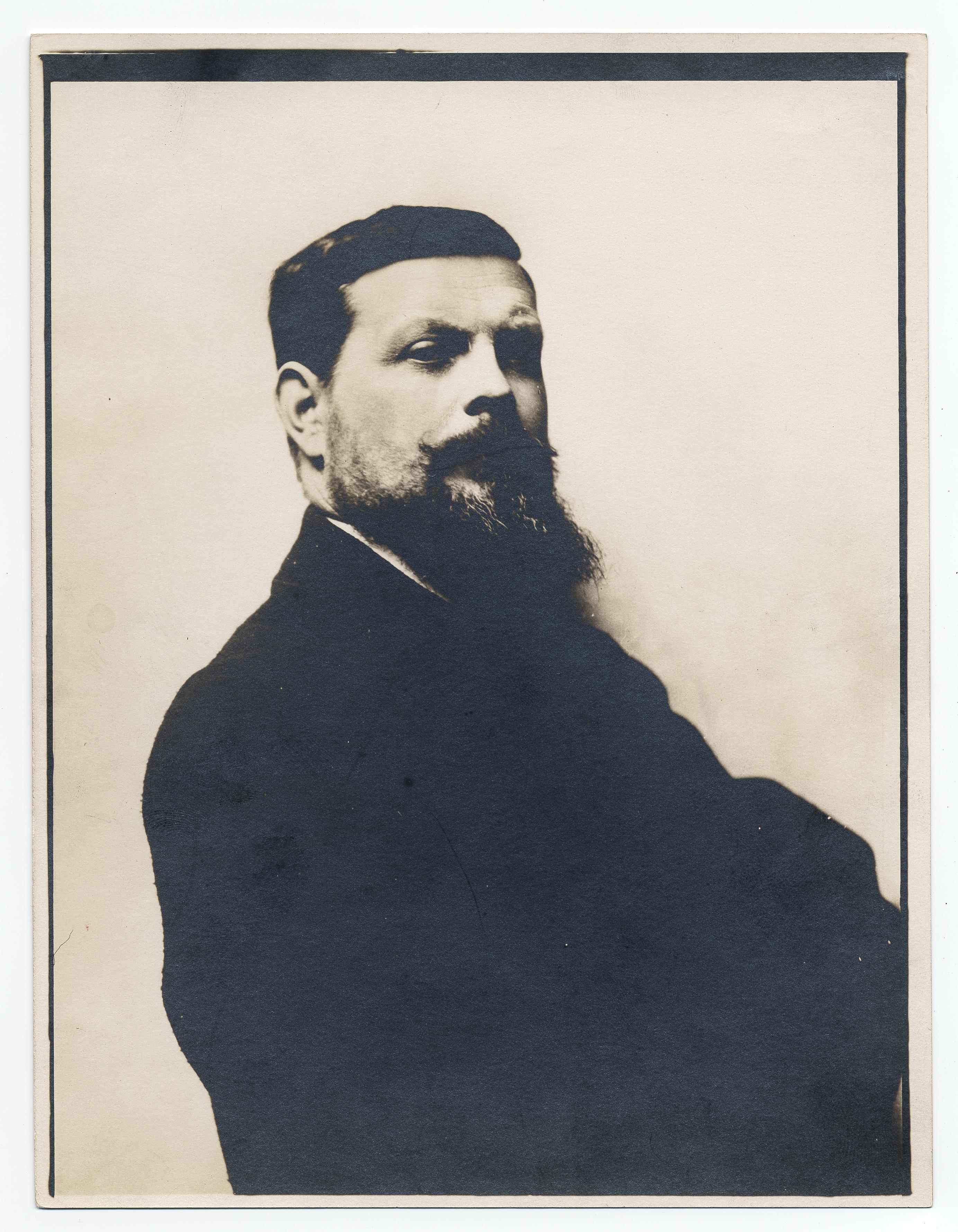 Description: Photographer unknown. Brangwyn, Frank...
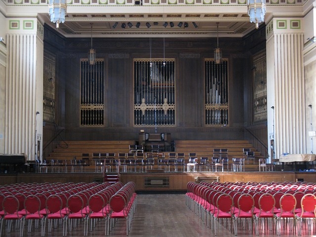 English: The Brangwyn Hall The Brangwyn Hall is a ...
 English: The Storys playing The Brangwyn Hall, Swa...