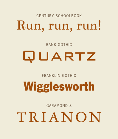
Designed by Morris Fuller Benton in 1930, Bank Gothic is a rectilinear geometric sans-serif typeface. It was originally designed for the American Type Founders, but in the 1980ÃÂs Linotype created a different version. This typeface is comparable to late nineteenth century engraving faces. Bank Gothic consisted of five types, being Light, Medium, Bold, Condensed Light, and Condensed Medium. These were cast in metal for hand composition, and were used that way for decades. Bank Gothic is distinct for having a small capital lowercase.
Morris Fuller Benton was the head of the design department of the American Type Founders. There he was the chief type designer from 1900 to 1937. He designed more than fifty typefaces. These varied from restorations of historical typefaces to adding new weights to existing ones. He also designed many originals, Bank Gothic being one of them. He came up with the term ÃÂgothicÃÂ, for which he had a wide range of typefaces, including Franklin Gothic, Alternate Gothic, and News Gothic.
 Specimens of typefaces by Morris Fuller Benton.
 Bank Gothic Light ;)
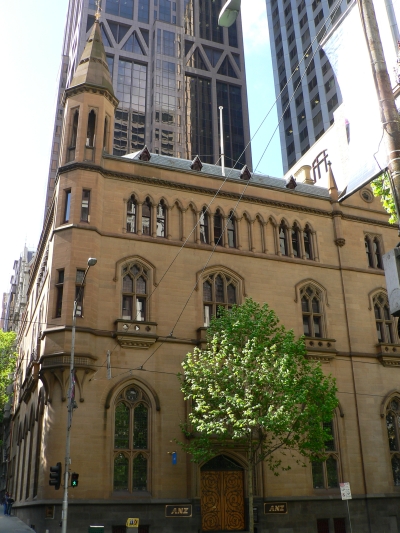 English: Gothic Bank, Melbourne
Some popular typefaces he designed also include Century Schoolbook, Garamond 3, and Eagle, which he designed for the National Recovery Administration, used on their Blue Eagle posters.
Bank Gothic was only an uppercase design until Linotype created a digital version in the 1980ÃÂs. Then it developed small caps characters to map onto the lowercase keys of the keyboard, which was rather innovative for the time. Linotype only digitalized one of the five variants, that being Bank Gothic Medium. Their version was wider than the original. Morris Sans, created in 2005, is a revised and extended version of the typeface.
Bank GothicÃÂs very popular use can be seen in practically every form of media, including movies, books, music, video games, and TV shows. It is used in the movie Hancock for its advertising. Frequent use of the typeface can also be seen in the Matrix series and The Day After Tomorrow. It is used on the cover of the Warcraft book series. The band 30 Seconds to Mars uses it in their logo. The classic videogame Goldeneye 007 uses the font, and it was also used in the TV program 24.
Bibliography:Felici, Jim. The Complete Manual of Typography. Adobe Press, 2002
 Century Schoolbook
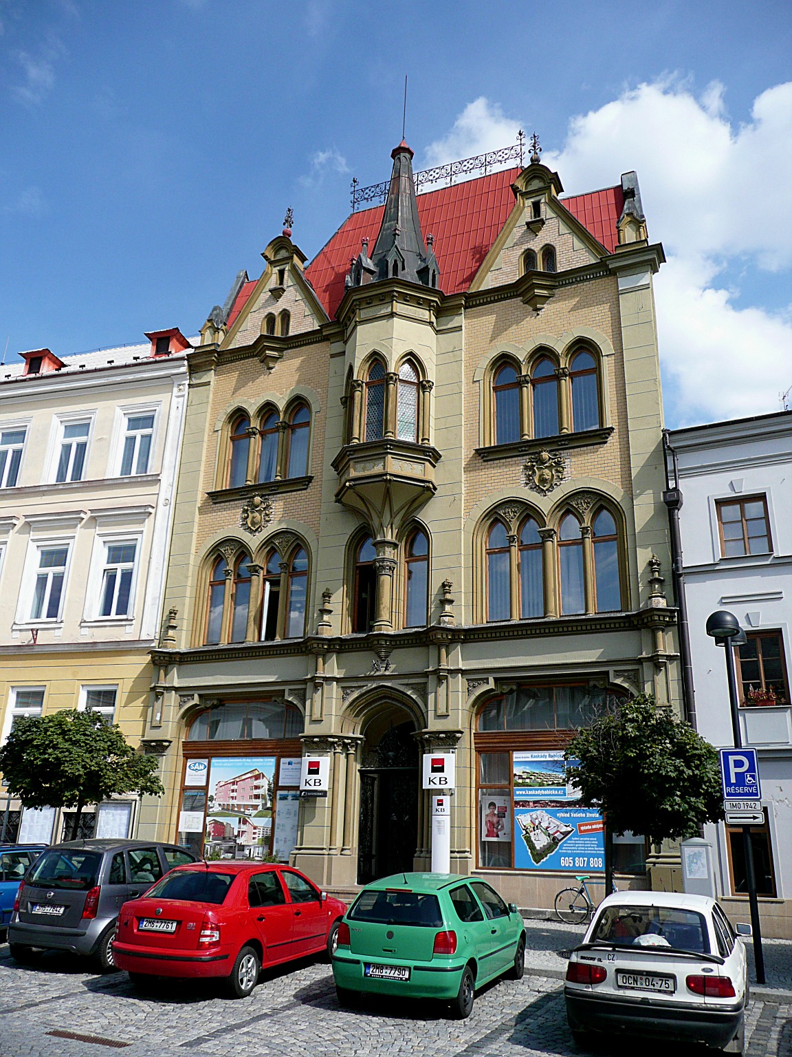 English: Savings Bank in neo-gothic style in Šter...
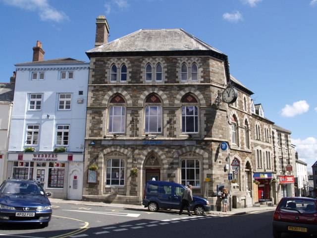 English: Bank in Launceston town centre A view in ...