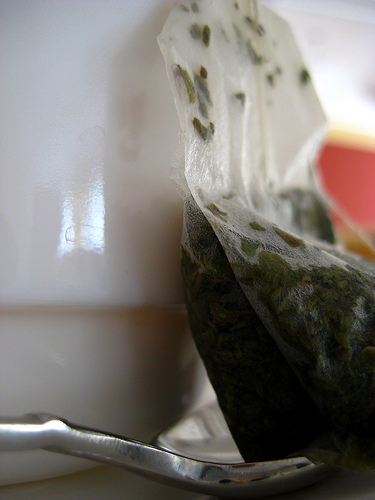
Having seen the packaging, the consumer picks up the drink out of curiosity, while other iced tea drinks have flashy fonts or colors for packaging, 'Arizona' Green Tea maintains its oriental look, providing a contrast that attracts the eye of the consumer and sells itself. The tea comes in a bottle with a light green opaque film around it. The film is illustrated and the top to the bottle is secured with a paper seal colored with an intricate and geometric design. The two other main ingredients follow the Green Tea wording on the label. The wording Green Tea itself is written in both English and Chinese.
The target consumers are people still in or just out of college, therefore in their late teens to their late twenties. With a pale green background the bottle's illustrations are of a tree growing small pink flowers, as well as a golden sculpture and a blue river flowing in the back.
 Green tea
 Drunk Bee
 safe drunk driving
The seal is around two inches in height and reaches the neck of the bottle. The 'Arizona' label itself is white and placed at a right angle, the rest of the wording is a dark green or black and a relatively smaller font.
The illustrations on the film are simple and not intrusive, they provide the bottle with a calm look that high to mid-class
college or recently graduated student might enjoy. By having not cluttered the bottle with very colorful or flashy images and given it, a simple, delicate design, the bottle seems calm. In a college or graduate student's life many things are changing and the students often try experiencing new non-traditional things, and the "packages record changing hairstyles and changing lifestyles" (Hine p.71). These new experiences may include less western ideas or products. 'Arizona' Green Tea does not thrust itself upon you but provokes a curious person to try it because it appears different. The tree illustrated on the bottle has tranquility provided by the simple curves with which it was draw and the limitation to two colors, brown for the branches and pink for the flowers. The paper seal is intricate; contradicting with the rest of the bottle, keeping it from being too simple and therefore bland. In a way it is similar to many other products that have a tendency to "sell their bottle rather than the drink." (Hine p.72) The attraction to the product is brought around by a simple marketing idea, being unique.
By having mentioned directly on the label the two other main ingredients, ginseng and honey, it gives a 'bonus' to the drink. It suggests that the product will provide you with energy and has been sweeten by a more health conscious sweetener. When someone twenty-years-old buys a beverage, usually they are
attracted to caffeine, although in high school this was almost strictly done in order to be cool, during the college years its ideally to have more energy to work, ginseng is an alternative to caffeine and alternatives can be attractive. By the this time, often the person will have turned more health conscience as well, honey being natural, suggestively, has many advantages over other sweeteners. Usually in areas like Southern California, the target group of around the late teen to late twenties, try to become more educated as far as their health is concerned, regardless of whether it is or not, if it sounds more nutritious, it becomes more popular hence the reasoning for adding honey to the label.
The 'Arizona' label itself is cleverly placed and colored, thus giving it the opportunity to be a larger font and yet not disrupt the tranquility set by other images. The white color allows the wording to blend in with the green background, especially with the position it has over the tree. The strong color contrast with the tree and the similarity with the pale green allows it to be large, easily read and not intrusive. This is another marketing trick although harder to accomplish, it tells the consumer the product name, without it being offensive.
The words 'Green Tea' have a small font, but by having accompanied it with Chinese words, it gives the bottle an
imported look, which attracts the consumer group, a group who is always looking for new things. The two Chinese words on the bottle although small, give the suggestion that the product is not only meant for the average American but perhaps for an East Asian consumer. This makes the drink's package more daring in a way; because it suggests that it was not put on the self to satisfy only this target consumer (you). Thus, the age group can take it as having been challenged to try a new experience. In much the same way this is similar to the groups that wore jeans because they "stood strongly in opposition to the dominate conservative, middle-class consumer-oriented culture of American society," (Davis p.88) the drink and many other products help people in the age group, to in way, rebel against racist, 'only if its made in the USA' type and therefore in their view be different and more internationally aware.
For its oriental, tranquil looks, suggestively more health conscience ingredients and international wording 'Arizona' green tea has gained popularity. It now follows the line of many other drinks which have entered this age group over the years, it appeals first to a few, who want to be different and then to almost everyone else to be more like the rebellious. 'Arizona' Green Tea has not only established a market for its product, but has become popular.
Very diverse and interesting
I honestly thought this was a very unique essay topic. It puts things into persepective that you wouldn't have thought otherwise. You knew what you were talking about and that is commendable..... good job
2 out of 2 people found this comment useful.