Summary:
This Nightclub/Restaurant, "Low Tide" will be the premier, high-energy, themed dance, restaurant, and nightclub in South-Western, Nova Scotia. Our goal is to remain a step ahead of our competition through an exemplary service provision. We expect our guests to have more fun during their leisure time. We will provide more video and electronic technology per square footage than anyone else in the region. A simple, yet unique, themed menu and atmosphere will create a sense of 'belonging' for locals and tourists alike. Our operating credo is: "happy enthusiastic employees create happy enthusiastic guests."
LOGO:
Below is our official logo in which the team created and decided upon.
After research on what would look best on the logo we turned to colour psychology to help us pick and create a design. Color is a meaningful constant for sighted people and it is a powerful psychological tool. By using color psychology, you can send a positive or negative message, encourage sales, and calm a crowd.
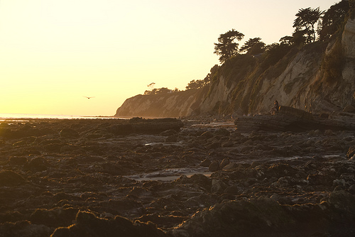 Low tide
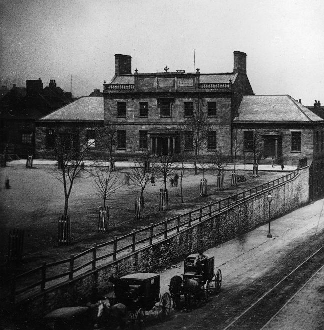 Dalhousie College, Halifax, Nova Scotia, Canada. T...
 Dalhousie University
The field of industrial psychology has a sub-field that studies only the psychology of color. It is no accident that Campbell's soup has used the same four colors on their labels for years and years. When I mentioned that product, I will bet an image of that label popped into your head. Blue, white, and black we thought would be the perfect colours for this logo. We used a Monochromatic Color Scheme the use of a single color in varying shades. It is soothing and pleasing to the eye especially in the blue or green hues. Below is what we learned this colours mean:
SUMMARY CONT.:
LOGO:
Blue
Ask people their favourite color and a clear majority will say blue. Much of the world is blue (skies, seas). Seeing the color blue actually...