The civil war was the only war that threatened to destroy America. Most graphs compare the population, factories, factory workers, railway mileage, grain products, and bank deposits. While all of this portrayed the industry in both the north and the south, which was a huge factor in the war, it didn't display more subtle and less known factors in the Civil War. This essay will analyze the seemingly minor, yet important faults that give a casual observer the wrong idea.
Looking at almost any graph that showed industry, an observer would believe that the north won the war, and that observer would be correct. The south had a population which was only approximately 40% in comparison to the north, counting the slaves who mostly weren't supporting the south. The South only had 18% factories in comparison to the north, 16% factory workers, 42% railway mileage and grain products, and only 25% in bank deposits.
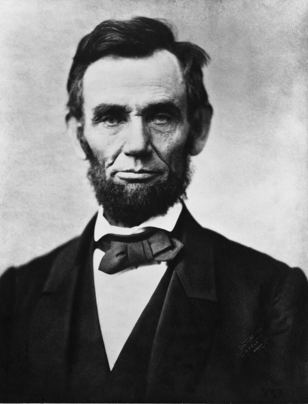 English: Abraham Lincoln, the sixteenth President ...
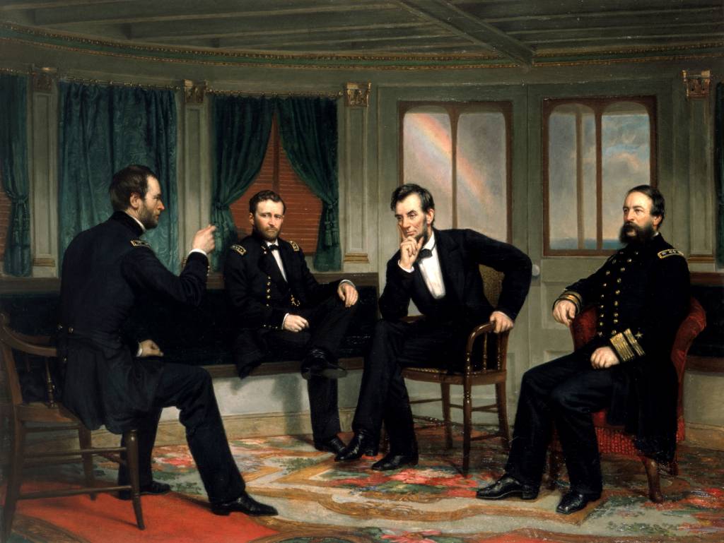 The Peacemakers.
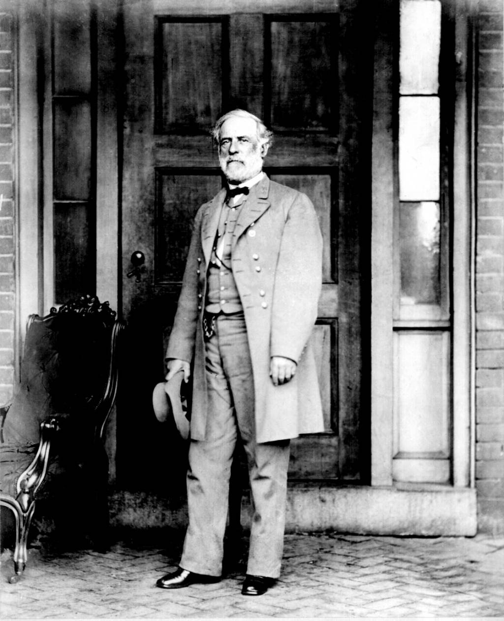 English: Confederate General Robert E. Lee poses i...
The North had better industry so they could make more and do more, and they had more population so their numbers were "never-ending". In fact according to this graph the north had more of everything. And so that's why the north won. So why did the south even believe it had a chance? And why did the war take so long? Well, there are three reasons why they did and all of them were subtle and not recognized by many people.
The south had better generals, among them Robert E. Lee who would have been President Lincoln's first choice for the union, had not Lee been from Virginia. Since Virginia was part of the Confederacy Lee joined did not join the Union. While this may not seem like much, it was huge since generals' decisions decided battles, and the war may have been decided earlier had...