Real Taste
My morning starts with a cup of coffee. It is usually a cup of tasty, strong and instant coffee. I realize that freshly grounded and brewed coffee will probably have a better taste but I still drink instant coffee. I started to think about the reason that makes me buy containers of Nescafe instant coffee and I took a closer look at the package. I realized that company is trying to manipulate my choice as a consumer with marketing tricks. In the process of my observation as a potential consumer I came out with some very important question. Why these tricks actually make consumers buy products? What kind of trick are these? What should customer do if they confused with their choice?
Red is dominant color of the label. It fully grabs the attention, makes this product very attractive to consumer and stimulates appetite for refreshing coffee with an aggressive promise of being energized.
 … more workers and consumers …
 Consumer
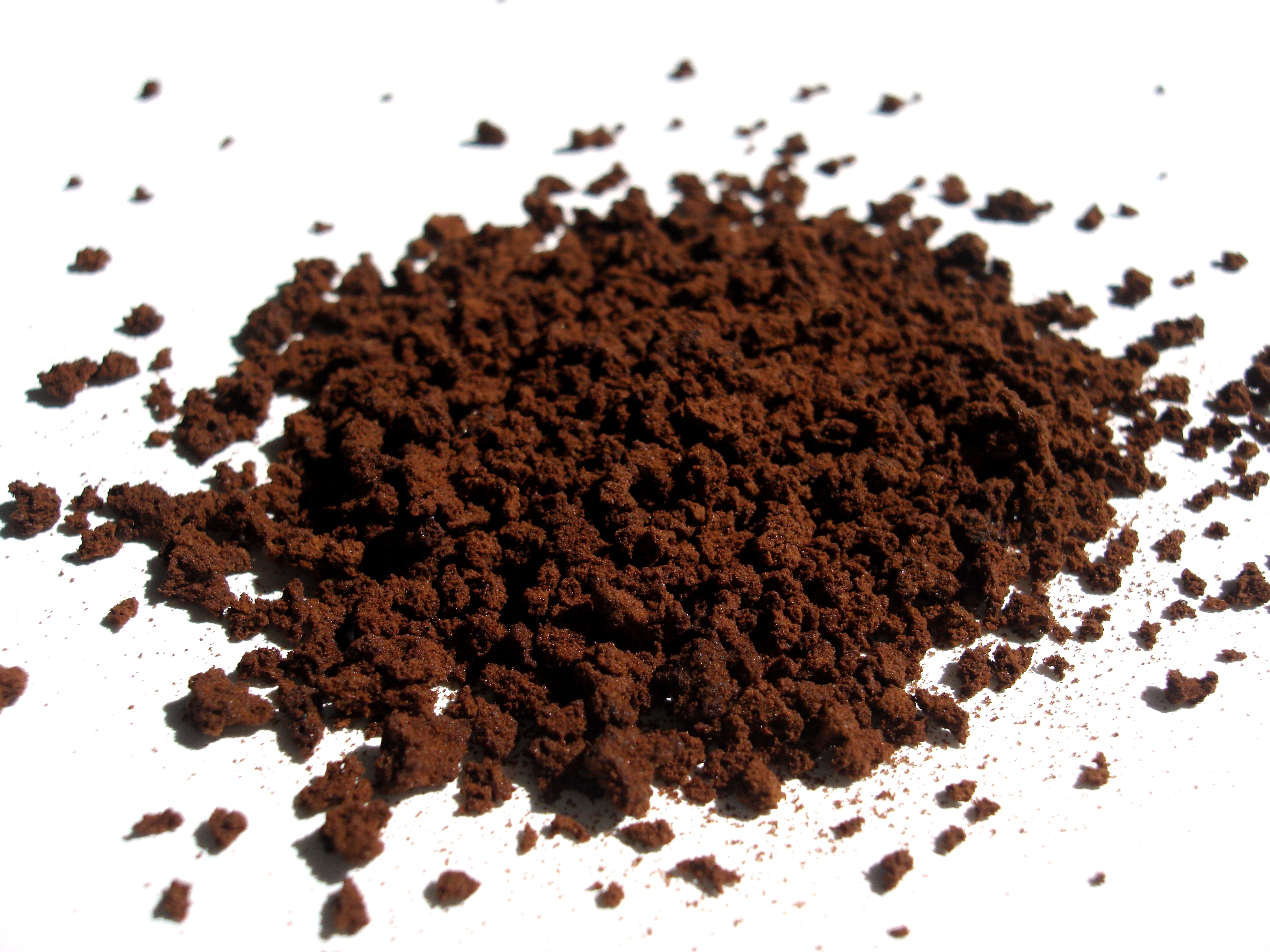 English: Instant coffee. Deutsch: Lösliches Kaffe...
The shape of the plastic container resembles the 8-shape, with wider ends and narrower center part. It also can be described as a cylinder slightly squeezed in the middle. The shape makes it very convenient to hold the container in the hand, which is a very attractive and important feature to a consumer.
The lid of the container is brown and has a special push button to open a package. This button allows an adult customer quick and easy access to the content of the package while making hard for kids. Instruction on how to properly close the lid are located on one of the sides of the container, other sides has a step by step description on how to make a perfect cup of coffee. These guidelines and advices that company placed on the package can be a symbol of concern...