The purpose of this film pamphlet is to influence and persuade as much people as people to watch the film. The pamphlet also briefly describes what the film is going to be about. This pamphlet attempts to do these things by visual, layout and language features to achieve its purpose.
 pamphlet stitch
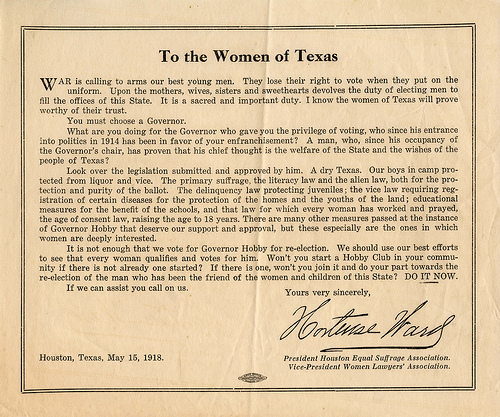 Pamphlet to the Women of Texas
 Red Pamphlet
A visual feature that helps to achieve its purpose is colour which is all over the film pamphlet. Colours may be used to create a feeling or mood depending on the context. In this particular film pamphlet, the colours have been put together to establish a romantic feel. The two most obvious colours on the cover of the film pamphlet are the orange of the title and the red of the chilli. These two colours are clearly creating a romantic sense. The tone of the title is quite light and that helps emphasise the feel of the advertisement for the title is called ÃÂA Touch of SpiceÃÂ. Having a light tone makes it seem as though the title was written out with orange spices and supports the word touch in the title which means a small amount in this context. The large chilli on the front of the cover is highly saturated. The red on the chilli is of a high degree of purity and that helps the advertisement gain the attention of consumers and also creates a romantic feel in this context. Red in this ad can be seen as an allusion because red is a very popular colour on Valentines Day which is seen as a very romantic day where many people buy cards and flowers and even plan special occasions for the ones they love. The many colours on this pamphlet achieve their purpose by creating a romantic feeling or mood and that will hopefully...