When you need up to date information about your high school, an accurate website could be your best choice. But if you're a student at Federal Way High, you're out of luck.
After thoroughly reviewing three local high school websites, it seems that not all are up to par. Federal Way, Thomas Jefferson, and Decatur were evaluated based on four criteria. These were navigation, accessibility, aesthetics, and accuracy. Each criterion has a scale of one to five and the overall score is the average from all the criteria. The scores given to the schools were 2 for Federal Way, 4.5 for Thomas Jefferson, and 4 for Decatur. Obviously, with Federal Way getting the lowest score.
When you go to any website, the first thing you see is the color and layout. You want the website to have something to bring you back, not give you nightmares.
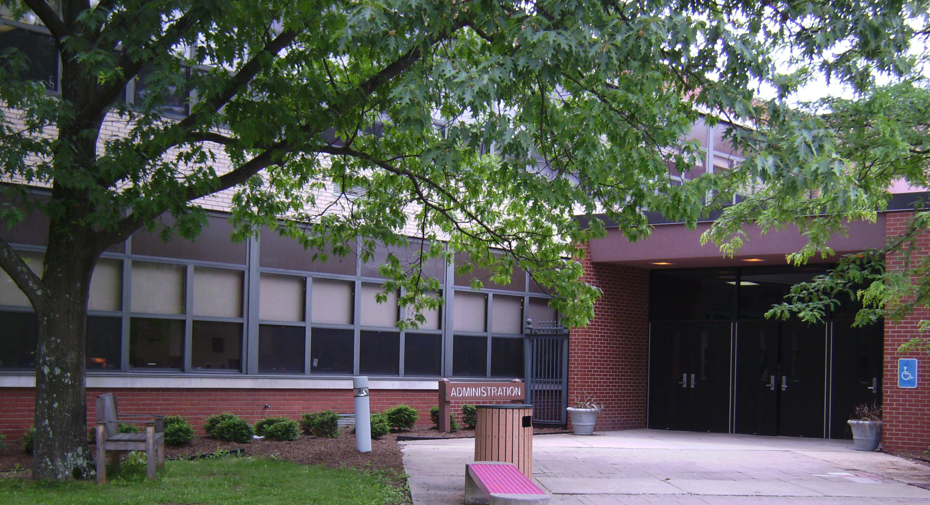 English: Thomas Jefferson High School
 Thomas Jefferson - Series of 1918 $2 bill
 Decatur Cemetery
This seems to be the first problem with the FW website. It has a soft blue background and thin yellow text. A picture that morphs into another picture but never really gets in focus on any of the pictures. And a column of useful information that has a white background and black text. When it comes to pleasing the eye, Thomas Jefferson knows what they're doing. A black background with bold lettering that stands out in white. There are also the school colors of red and gold strewn about the site. However, they lost a point for having so much information on the homepage. You don't want to be blasted with information when you first get to a website. That was also a problem for Decatur. At the top of the page there is a block of links and then a block of bigger text that goes on and on.