ENG 105 The Sharper Image How many ways can you think of to sell cologne? Well I can think of many, but the one, which I found disturbing, was ACQUA DI GIO for men. In this ad there is no words said, no slogans, or trick. The ad is two pages in which they attempted to get their product sold is by the feeling they attempt to portray when put on. It is trying to sell it product by appealing to the consumers giving you a feel of confidence and sex appeal when you put it on.
The first page that is in black and white has a G.Q model with his hand running through his hair. His hair, which is combed back, looks wet yet his face and hands are dry. He looks directly at the reader with a serious look on his face. The model looks at the reader with a sense of confidence that shows in his eyes.
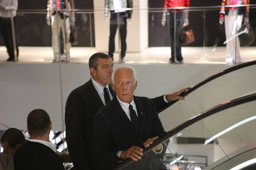 Vogue Fashion's Night Out Sept.10 2009 MILANO
 Deutsch: Bojan Gavric, Moskau, Kaufhaus GUM, Red N...
 Water cycle http://ga.water.usgs.gov/edu/watercycl...
Using black and white colors gives the model a old fashion attractiveness to the him. It creates shadows in order to add sharper definitions to the curves on his face. The ad has ACQUA DI GIO for men written at the top and of the page and Giorgio Armani at the bottom in white bold letter.
On the second page has water from a river or stream hitting a rock, also in black and white. The water splash covers the whole page, spreading to the edges. Near the edges of the page, the water is blurry giving it the look as if the water is moving towards the reader. At the bottom left corner there is a bottle of ACQUA DI GIO in color. The bottle is a musk color with a silver top. It doesn't show the frosted texture to it, which is clearly visible on the bottle. The splashing water supposedly gives the reader a fresh feeling of nature that quenches your thirst when you spray the cologne on. The rushing water emphasizes this type of feeling you get. It also gives the reader a perspective of the type of person that would buy this cologne. The type of person they view as buying the cologne is a sporty, outdoorsman type of person. The page also has a sample of the cologne that you can smell. This is an attempt to make hand fit the glove.
Personally this ad doesn't appeal to me. It doesn't persuade me to buy the product. First of all the ad has a model that has better looking then me, which doesn't persuade me in think using this product would make me look that appealing or even like him. There is no creativity in the ad. Because there is a model, in black and white, running through his hair with a serous look on his face. To me the ad attract to woman and homosexuals and as far as I can tell I am not either one. The second page doesn't do anything for me either. There is water splashing on a rock, big deal. Even though the cologne is called acqua, to me this is an ad for a raft or something to do with water. I really think they could of got their point across better.
 Brigitte Bardot à un cocktail en 1968
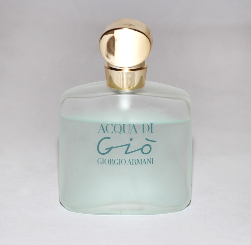 Giorgio Armani: Acqua di Gio femme
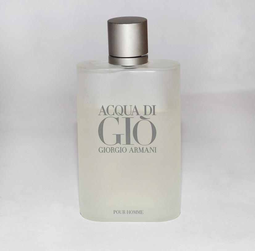 Giorgio Armani: Acqua di Gio for men