The two film posters I am studying are "The Exorcist" and "The Shining" both of which are part of the Horror genre.
In both posters many visual and written codes are being used. Firstly in The Exorcist poster the visual codes used includes the dark silhouetted house with the bright angelic light shining down on the man a very typical horror film set up with symbols of good (the light shining down on the man) and symbols of evil (the dark and scary looking house). The green glow surrounding the man is another visual code, which is used to signify eeriness and an atmosphere of unrest and evil. A further visual code is the blackness around the house, signifying the dark and evil mood of the film. Furthermore The fact that the man pictured is just standing and looking at the signifies a sense of anxiety and fear of what he is going to find when he enters the house.
 The Amityville Horror (2005 film)
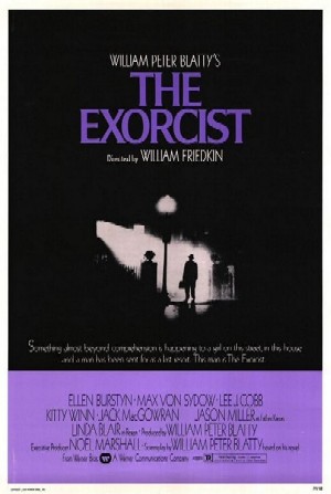 Film poster for The Exorcist - Copyright 1973, © ...
The written signifiers are firstly the name of the film "The Exorcist" suggests that the narrative will be based around an exorcism. Also the caption at the top of the poster "the scariest movie of all time" sets a goal for the film that the audience will now want to see achieved.
The poster for "The Shining" uses visual and written codes in a different way. The first obvious visual signifier is the man forcing his head through a door with an axe in it, this is displaying the mans insanity or anger and shows that the narrative will probably be involved around his growing insanity and madness. Also there is a further visual code of the woman in the background screaming showing that there is a lot of fear and suspense in the narrative.
As far as written codes there isn't really any on the Shining poster as the text is written in a style of writing that you wouldn't normally associate with a horror film
In both posters there is not much information given away about the film itself. In the poster for the Exorcist you can make judgements by the visual and written signifiers like the name of the film and the mood that is set up by the colours used on the posters gives away that the narrative is based around an exorcist or an exorcism and that it will be scary and eerie set up.
The shining poster lets us learn that the film is about a woman trying to escape from a mentally unstable person, and this is just from the simplistic visual signifiers in the picture of the man forcing his head though a door into a room that the woman has probably locked herself away in showing mental instability and revealing in short what the film is based around.
On the Exorcist poster there is a lot of credits and the title of the film is there in bold, I would have expected to see a certificate however. On the Shining poster there is only minimal textual information and this is the film title and the main two stars of the film, there is also the one photo taken from the film. I would have expected to see more credits and whom it was released under.
There is a sense on enigma in both the posters, especially on the Exorcist poster as there is a picture of a man standing at the gateway of a poorly lit house in a powerful ray of green light shining out from a bedroom window. All these things set up a sense of mystery as to what the man is going to find when he gets in the house and what is in the bedroom window. The Shining poster creates a sense of enigma surrounding the character forcing his head through the door and what he will do to the women who is screaming.
The posters set up diequilibrium in different ways. The Exorcist poster shows that the eeriness and danger surrounding the house and that the man in the light may be there to resolve the disequilibrium. In the shining I think the Disequilibrium is more obvious as there is the woman who is trying to escape the man who is clearly out of control.
The Exorcist poster follows the generic conventions of horror more than the Shining poster I think. This is because it has the typical poorly lit spooky house on a dark foggy street with dim and eerie green lighting and a silhouette of a mysterious figure-which is very conventional of horror films. The Shining has less conventions but it still has some. Firstly the screaming woman that is a regular occurrence in a horror film and also the crazy and disturbing character that is trying to kill her which is also conventional. There is also a lot of white in the poster, this could possibly be associated with the colours that are known to be in asylums which symbolises the mental instability of the character in this film.
Good ideas here, though you could sum it up a little better
Liked this, a different approach to film and similar media, though I think you have fallen into the trap that I think a lot of people (including myself) fall into, the fact of summing up. I was taught to sum up everything into one paragraph, saying what can be learned from this etc. I see you have tried to sum it up, though it might need a 'finishing off' sentence. Cool essay though.
Best Wishes
1912babe
5 out of 5 people found this comment useful.