What Makes a Great Website?
IKEA.
IKEA's website starts out by offering the visitor 35 different language choices. This was an exciting and unique way to begin the shopping experience. Each language choice has a unique first page, which speaks to the culture of that country. The initial page also lists two recalled items, which was a show of great customer service due to the location at the top of the page and the size of the recall notification. This was impressive as this was not something that would bring in additional revenue but spoke only to customer service.
Visitors touring the site are immediately aware of the simplicity and organization that the site has to offer. Moving from page to page is easy. The colors are great and the prices are readily identifiable. Items are available in a variety of colors and the visitor can easily click on the preferred color and see the actual item in the chosen color.
 website
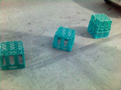 Crates Καφάσια
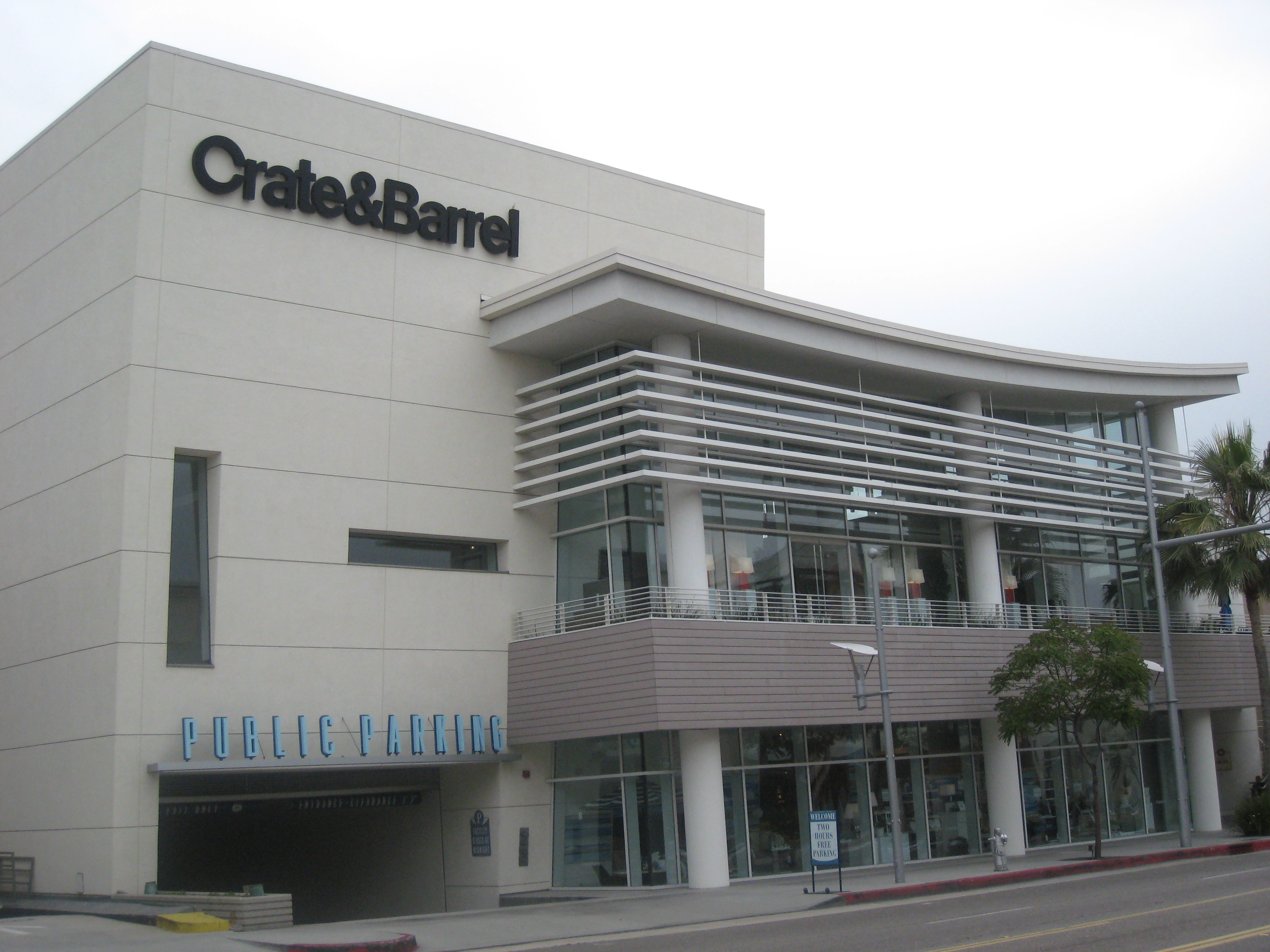 Crate & Barrel store on Beverly Drive in Beverly H...
No color swatches here. The visitor can view the actual chair that they have chosen in the color of their choice. Items are completely described making it easy for the visitor to feel confident that the item will meet their unique needs in the areas of size, fabric blends and laundry instructions. It seems that there are no surprises waiting for the buyer when the item actually arrives.
The web designers followed understood standards for design and used white backgrounds with bright, easy to read type, copyrights are at the bottom of each page along with the site index and privacy issues statement.
The site could be improved by enlarging the size of the displayed items in each section of the site. The initial view of each item is very small and this tends to give the viewer...