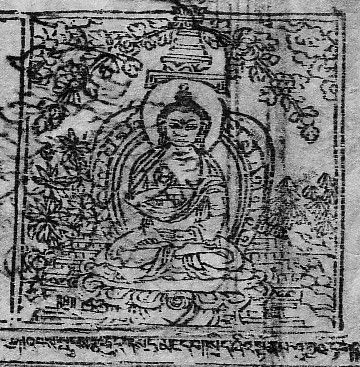
Amongst the many brilliantly crafted Tibetan Buddhist paintings, two Buddha Shakyamuni tangkas, one dated circa 1300-1399 [painting no. 646] the other dated circa 1500-1599 [painting no. 39] caught my attention because of the many differences in style and composition between the two.
Shakyamuni (painting no. 646) has not been linked to a certain lineage or specific region of Tibet but shows strong evidence of a Nepali style common in paintings from the south by its use of geometric composition and the dominance of red and blue hues throughout the setting. The brilliance of its coloring makes it hard to believe that the two paintings were both done with ground mineral pigments. The later painting is far more faded and less opaque. It's evident that the artist of painting no. 646 had put more care into the mixture and application of the pigments. And unlike the flat, open, solid areas in the later Shakyamuni, every space is filled with imagery and dynamic characters, leaving very little negative space or areas unadorned.
 Buddha Shakyamuni Teaching the Kalacakra according...
 English: shey palace
 see filename
The artist was precise in his placement of images to bring the piece together in perfect symmetry and balance. For shading and adding dimension the color deepens subtly around the edges of almost every object and character, making their facial features more expressive and pronounced. The distinction between each object and character is created by bold black line and bright contrasting colors, creating sharp edges.
Shakyamuni, the central image, with deep yellow skin, somewhat peaceful in appearance, gazes forward with slightly closed eyes. The brows have a heavy arch and the eyes a severe slant which curve up in the corners, making his expression more dramatic and a bit menacing. He is poised in perfect balance in the mudra of meditation as with the characters which surround him. His solid...