Through the World Wide WebNokia is able to reach all of these countries and provide these countries with valuable information that can be used to make purchase and investment decisions. However, for Nokia to be successful through their website, Nokia must pay particular attention to five different dimensions, which are: ÃÂ÷ Aesthetic appeal ÃÂ÷ Interactiveness ÃÂ÷ Currency ÃÂ÷ Information Value ÃÂ÷ User Friendliness The purpose of this report is to analyze Nokia's website based on these five dimensions.
Aesthetic Appeal Nokia's main homepage consists of a white, blue, and black color scheme and a graphical interface that is easy to use. The use of little color and a purposeful design of the website help the viewer browse the website easily and without overwhelming, intricate designs or fancy color schemes. One of the key successes of any company website is how well their website is designed and what colors are used to attract customers as well as potential investors.
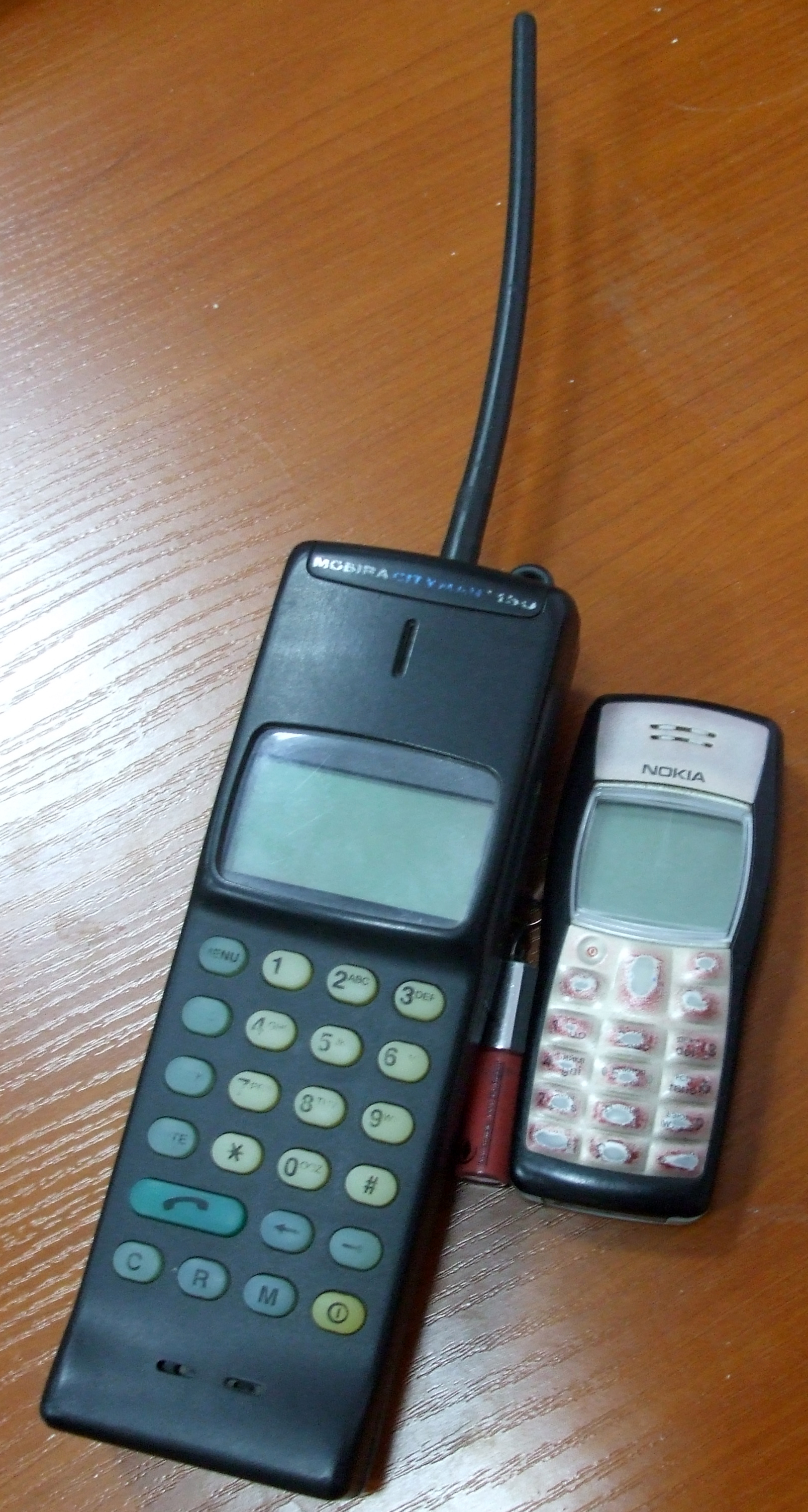 Nokia 150 (large) near Nokia 1100 (small) and lip ...
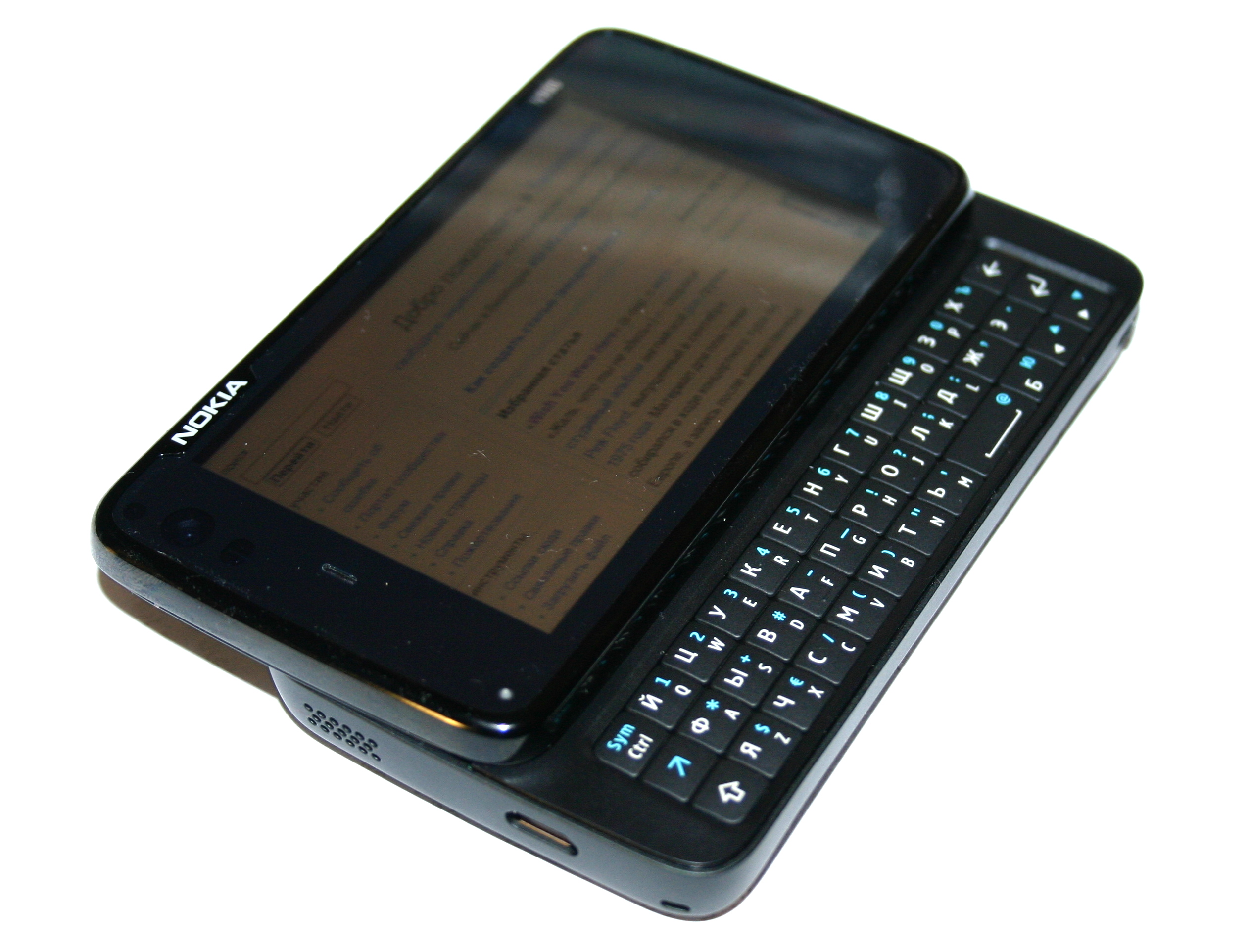 English: Nokia N900 communicator/internet tablet �...
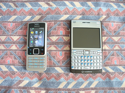 nokia 6300 e61i e61i-1 gsm mobile phones
Simplicity along with a tasteful color scheme and a thoroughly contemplated design is key to the success of a website. Although Nokia's website was very simplistic compared to many other company websites, it was well developed and visually attractive. The blue and black lettering on top of the white background allows the viewers to see the text and the pictures clearly. Although this is Nokia's main company website, they have a website for every continent as well as country specific websites that also carry the same or similar distinct design and color scheme Interactiveness Nokia's main website is geared toward the global market but has links that will connect the browser to any of the specific countries that use their phones in their cellular network. The main website also has a contact information link that may...
Good
Contents were good. For APA purposes, the paper had too many pronouns. If the pronouns were taken away, the paper would flow better.
0 out of 0 people found this comment useful.