The Harvesters In Bruegel's 1565 painting, The Harvesters, he portrays a season most closely resembling late spring, right after the harvest. He does this on the surface level with the peasants and the wheat. However, he solidifies this relationship by forming concrete relationships with diagonals and parallels, depth, colors, and nature.
Bruegel's use of diagonals and parallels are easily visible in this work. In fact, he uses two different diagonals that intersect one another: one has a negative slope and one has a positive slope. The latter of which is perhaps more evident, because it outlines large portions of land that lie on this positive slope. One can see it at first glance. The gold foreground, and the green and gold middle ground are both on diagonal line paths going from bottom left to upper right. The most prominent peasant, the one lying on the ground against the tree, also falls on this diagonal.
 This painting is on display at the Kunsthistorisch...
 Two examples of star diagonals
 English: A digitally created image depicting fract...
In my opinion, his subtle use of the contrasting diagonals is much more intriguing. In the extreme foreground, one can see loose parallelograms of wheat that, when looked at as a whole, follow the aforementioned positive diagonal. However if one looks at each parallelogram separately, one can see that they are on a contrasting negative diagonal that stretches from bottom right to upper left. The packed wheat in the foreground follows the positive diagonal, however if one looks closely, one can see a path cutting through this packed wheat. This path is a diagonal directly contrasting to the diagonal of the packed wheat as a whole. This theme recurs in the green and gold middle ground as well. The green and gold middle ground also has a bulk of land on the positive diagonal and a path or two that contrast it, by forming a negative diagonal.
Bruegel also uses these diagonals to convey depth. As one stretches from bottom left to upper right on any of the positive diagonals and from bottom right to upper left on any of the negative diagonals, it is clear that one is moving further "up"ÃÂ on the painting and therefore deeper into the scene. As one moves deeper, the first thing that can be seen is that the peasants and trees become smaller; this tells one that they are further away. Also, a point that I found very interesting is that detail and color fade as one goes deeper into the scene. In the foreground, one can see each grain of wheat, but as one progresses through the scene there is less detail.
Color is a very important relationship established by Bruegel in this work. There are three colors that dominate this painting: gold, green, and gray. The foreground is gold, the front middle ground is green, the back middle ground is gold, and the background is gray. There is a consistent interaction between the gold and the green. There is green in the gold paths and there is gold in the green paths. Just to the right of the huge tree, there are two houses: one is gold and the other is green. Remaining consistent with the rest of the painting, the gold house is closer to the viewer than the green one. Even the breadbasket contains gold and green inside of it. The gray background, although I was unable to see it immediately, plays an important role in the work. First, it is not a diagonal. Almost all of the gold and green are part of a diagonal, whether it is the positive or negative one. As I mentioned before, Bruegel uses the diagonals to convey depth. If Bruegel were to have the gray background on a diagonal too, it would have implied that he was heading towards something else, which would no longer make the gray a background. He wanted completion and did so by keeping the background on a horizontal axis. However, Bruegel did not totally alienate the gray from the rest of this work. In order to keep the flow of colors, Bruegel inserts faded land into the gray background. In the postcard it is not as clear, but in the painting one can see that there is more green and gold land in the distance. This serves as a transition from the fore and middle ground to the background.
In my opinion, the most important feature in this painting is the huge tree just off center. This tree serves as a link between all of the points that I have made already and the final point that I will make shortly. First I discussed the diagonals, both positive and negative in this work. The tree has both. Each branch to the left of the trunk is a negative sloped diagonal and each branch to the right is positive. The tree is also a microcosm of the color scheme. Forgetting depth for just a second, and concentrating on the painting from top to bottom, one can see that the tree is gold at the bottom matching the area around the bottom (the foreground). As one moves toward the top of painting, one can see the green leaves of the tree that blend with the middle ground. The tree also allows for the gray to seep through between its branches. Another interesting similarity between the tree and the painting as a whole is that as one progresses from the top to the bottom of the tree, the trunk gets thinner. This is similar to the way Bruegel has portrayed depth throughout.
In a 1998 exhibition, Bruegel was claimed to be ""æa passionate observer of nature in all its form."àThis painting leads me to believe this statement. Bruegel includes the huge tree, which is surely an object of nature. He masterfully depicts the harvesting season. Most important to my reason for believing, is the actions of one man. He is the prominent peasant that was mentioned earlier. He is perhaps the most natural part of this painting. His fellow peasants are still sitting next to him eating, but he has eaten so much that he has passed out; a completely natural human reaction. Bruegel, throughout this work, remained consistent with his main themes. What makes this so intriguing, however, is the great extent to which he developed them.
 English: Slitherlink; Diagonals of a 3 and 1
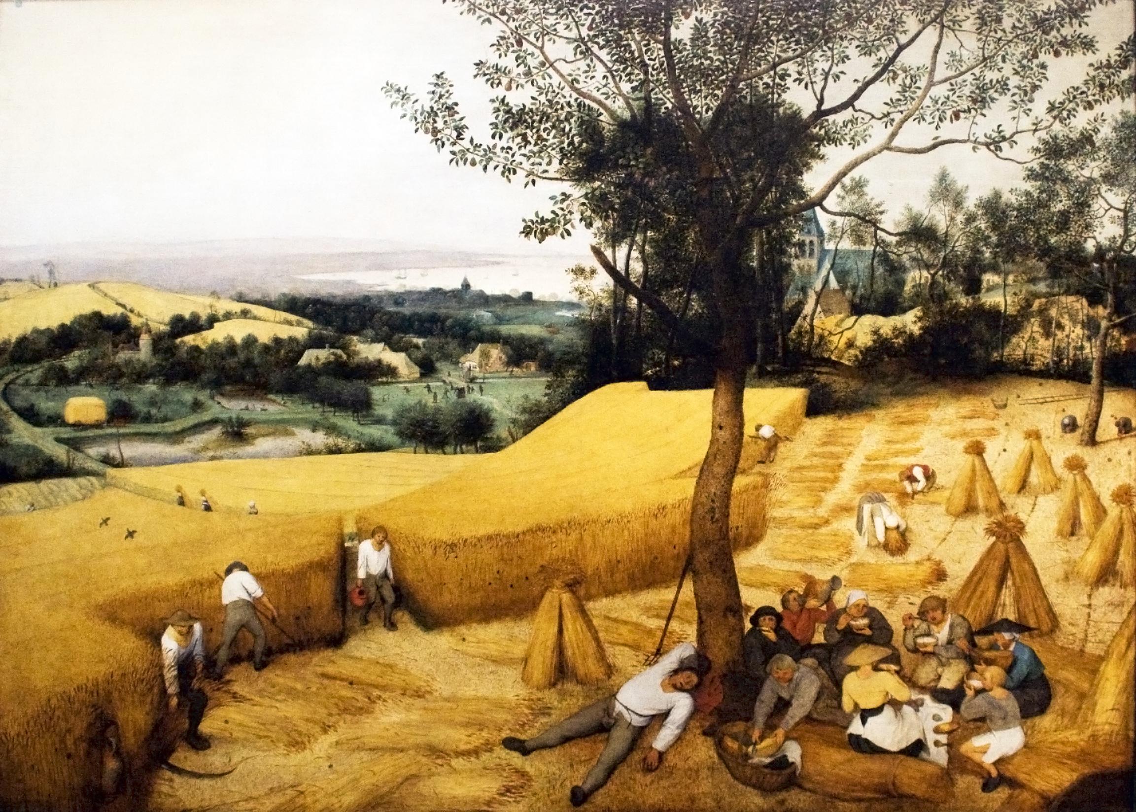 The Harvesters